
The best logos are beautiful, versatile and most importantly, memorable. Getting a logo designed involves a deep understanding of your brand and audience and the ability to communicate all of that to a talented designer through a brief. For this last part, it helps to have some creative logo inspiration to reference when deciding what shape your own logo should take.
To this end, we dove deep into our design database and have gathered the 99 best logos created by our Top Level designers. And to make this list manageable, we’ve grouped logos by type, so whether you’re looking for a striking symbol, a lovable mascot, or a classy monogram, we’ve got you covered.
- The best logomark logos
- The best emblem logos
- The best mascot logos
- The best font logos
- The best logos of all time
Here are the best logos to inspire you:
The best logomark logos
—
A logomark refers to a specific icon that accompanies the logo’s brand name. The advantage of a logomark is that it associates an image with your business, creating an easily-identifiable symbol. There are two main types: pictorial and abstract.
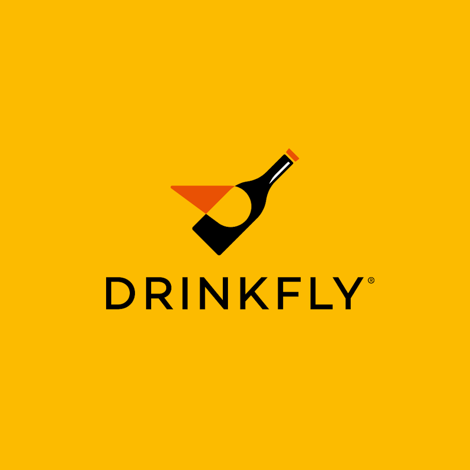
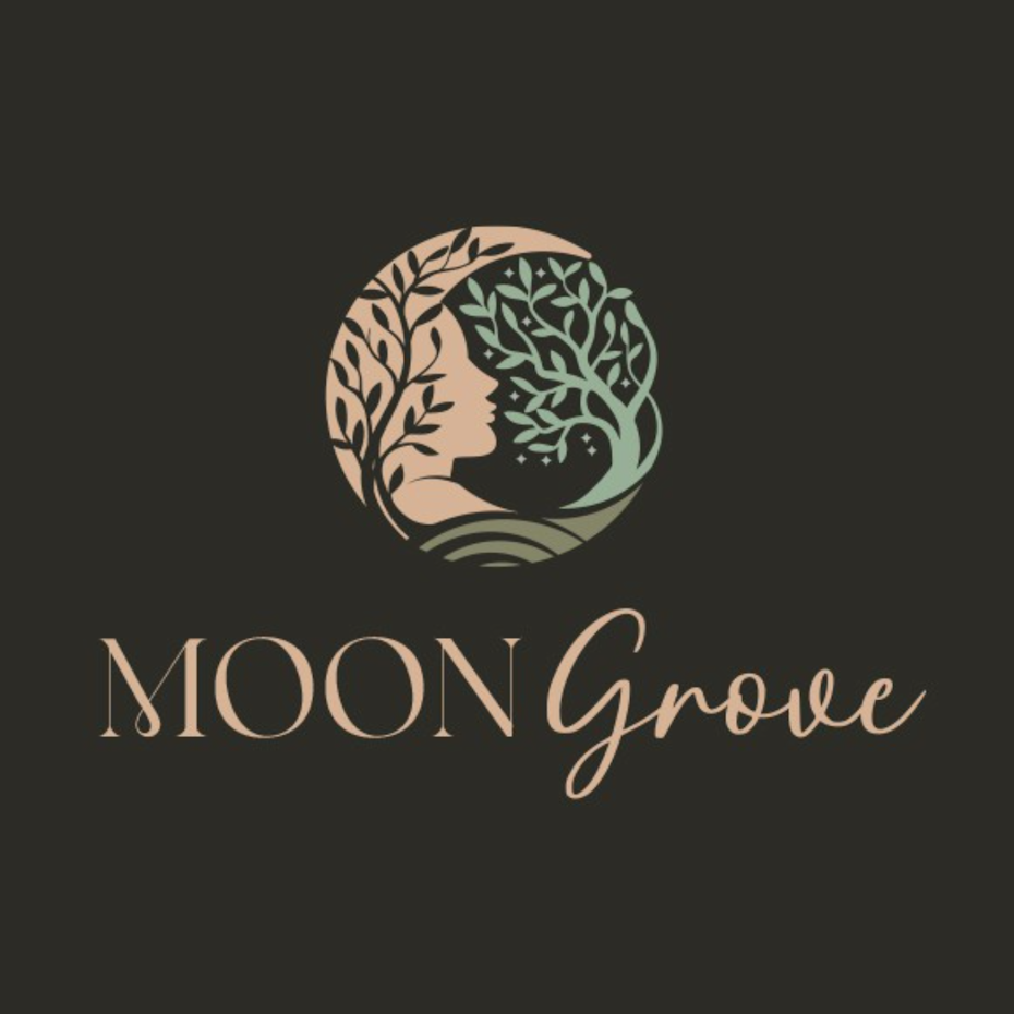
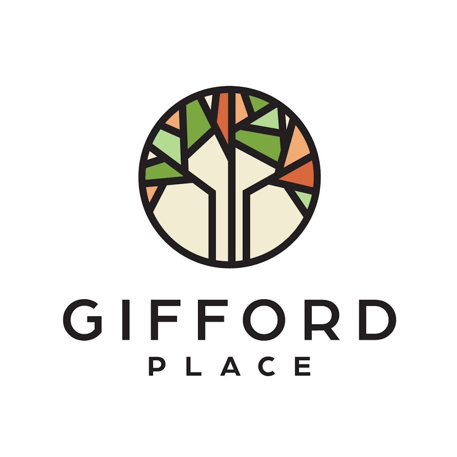
Best pictorial logos
Pictorial logos are based on recognizable images, like people, animals or objects. Sometimes these images have built in cultural meanings—like a tree standing for growth or a fox implying wits—and sometimes they can create their own meaning—like the iconic Apple apple or Twitter bird. It is also common to combine symbols, harnessing the power of compound meanings or creating a visual pun. Whatever your approach, it is important to familiarize yourself with the underlying symbolism to make sure the logo is communicating the traits that you intend.
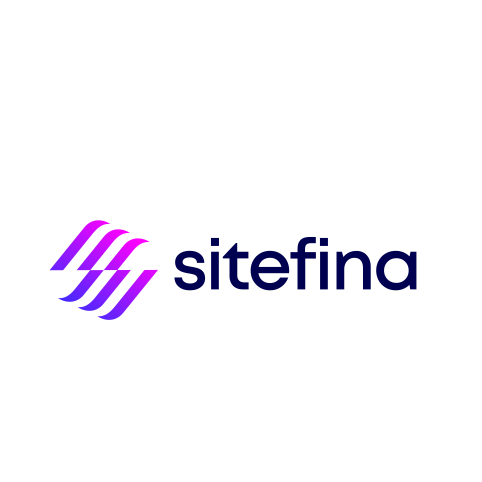
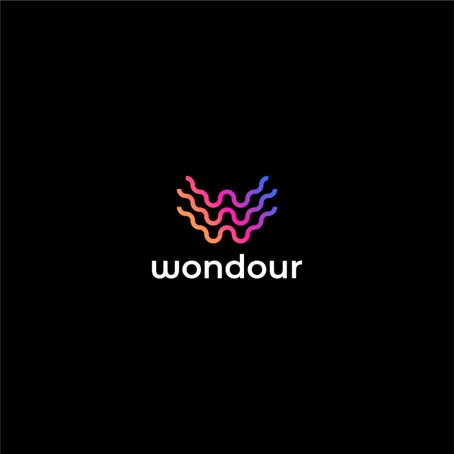
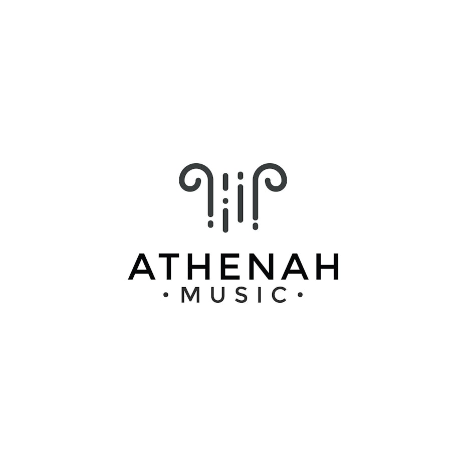
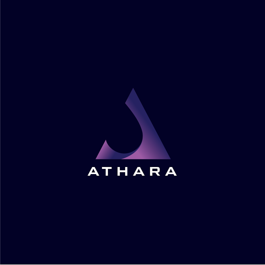
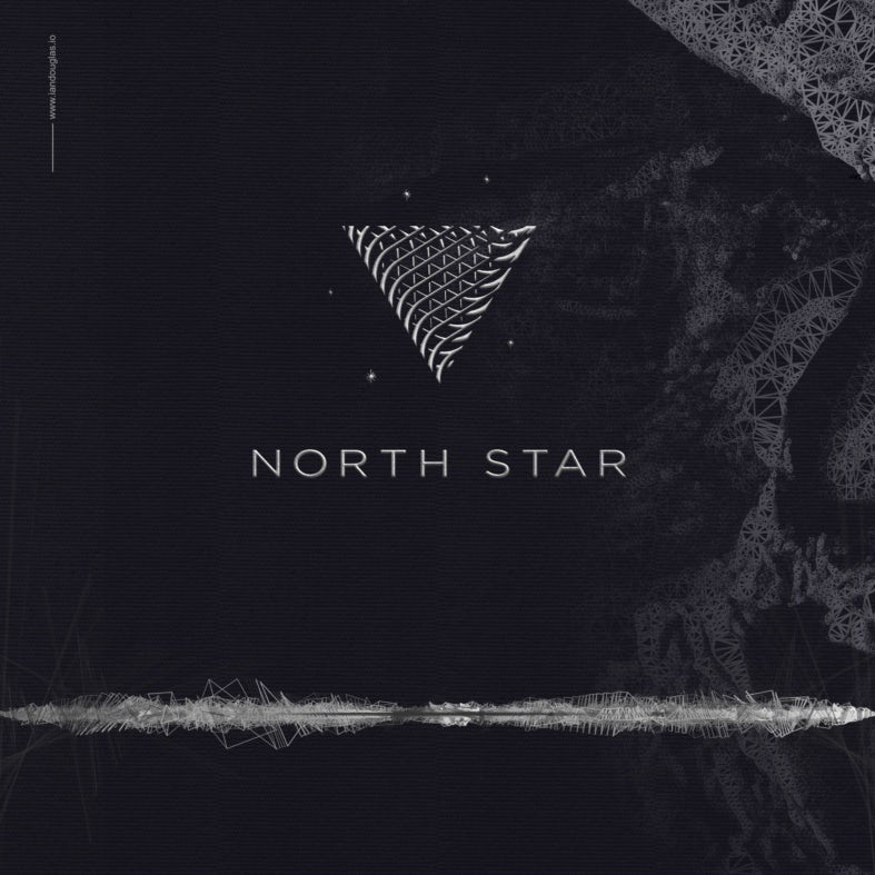
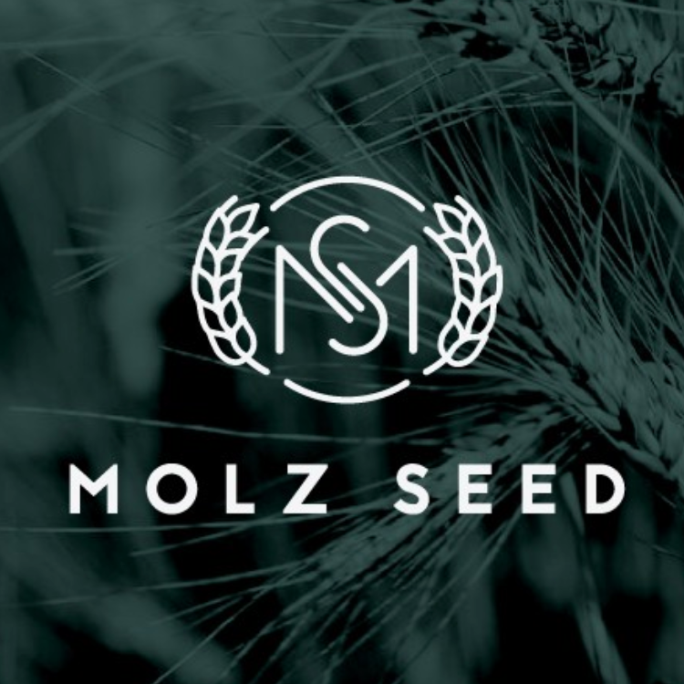
Best abstract logos
In place of representational imagery, abstract logos create their own original symbols through shape language. Geometric styles lend themselves to logos that are orderly and precise. Organic shapes, on the other hand, create logos that are fluid and expressive. All in all, you will be forging a path all your own with an abstract logo. But it will also be uniquely you.
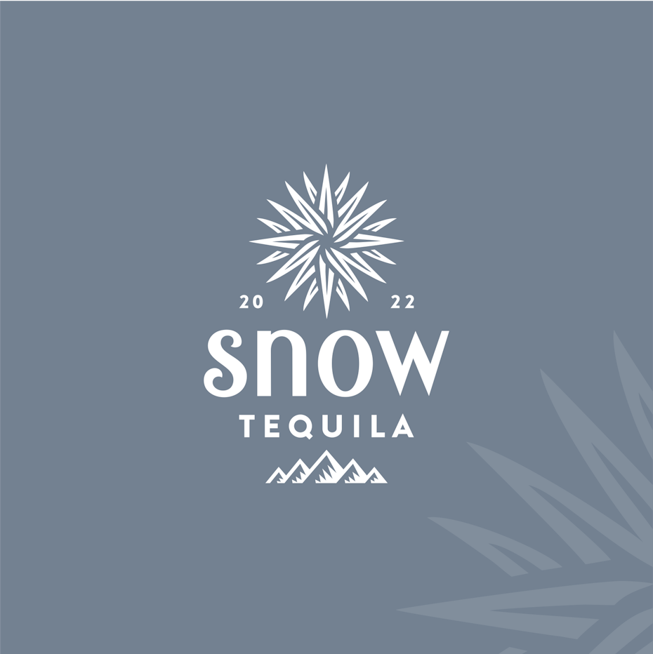
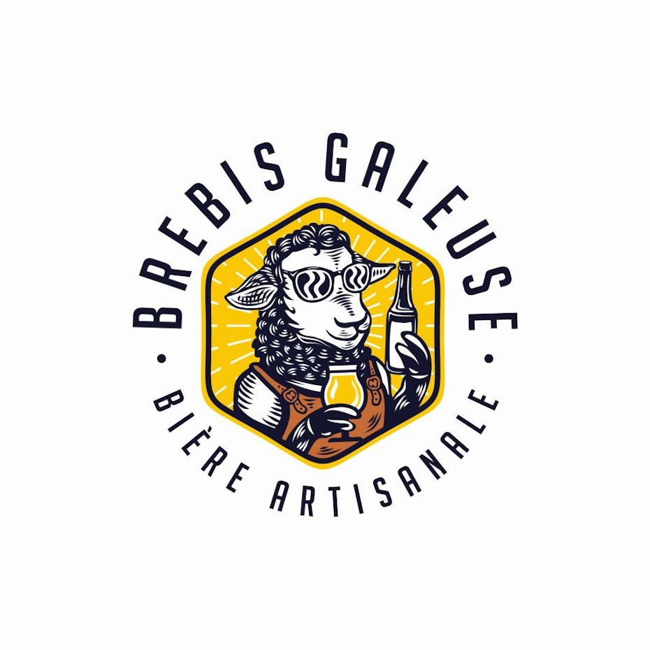
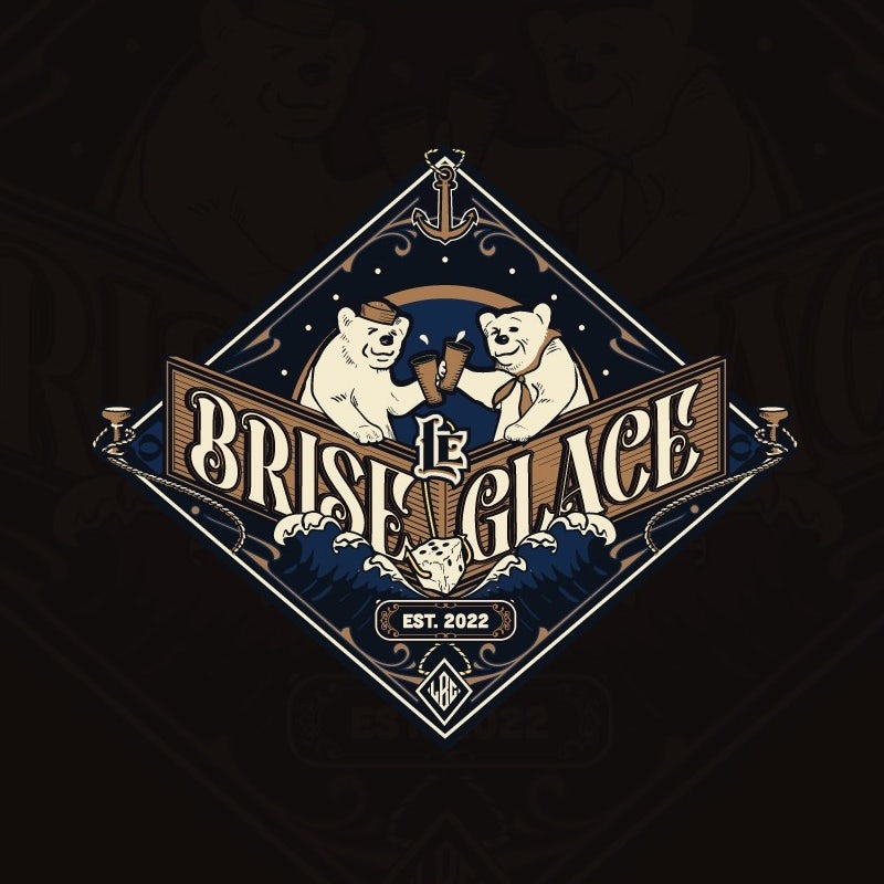
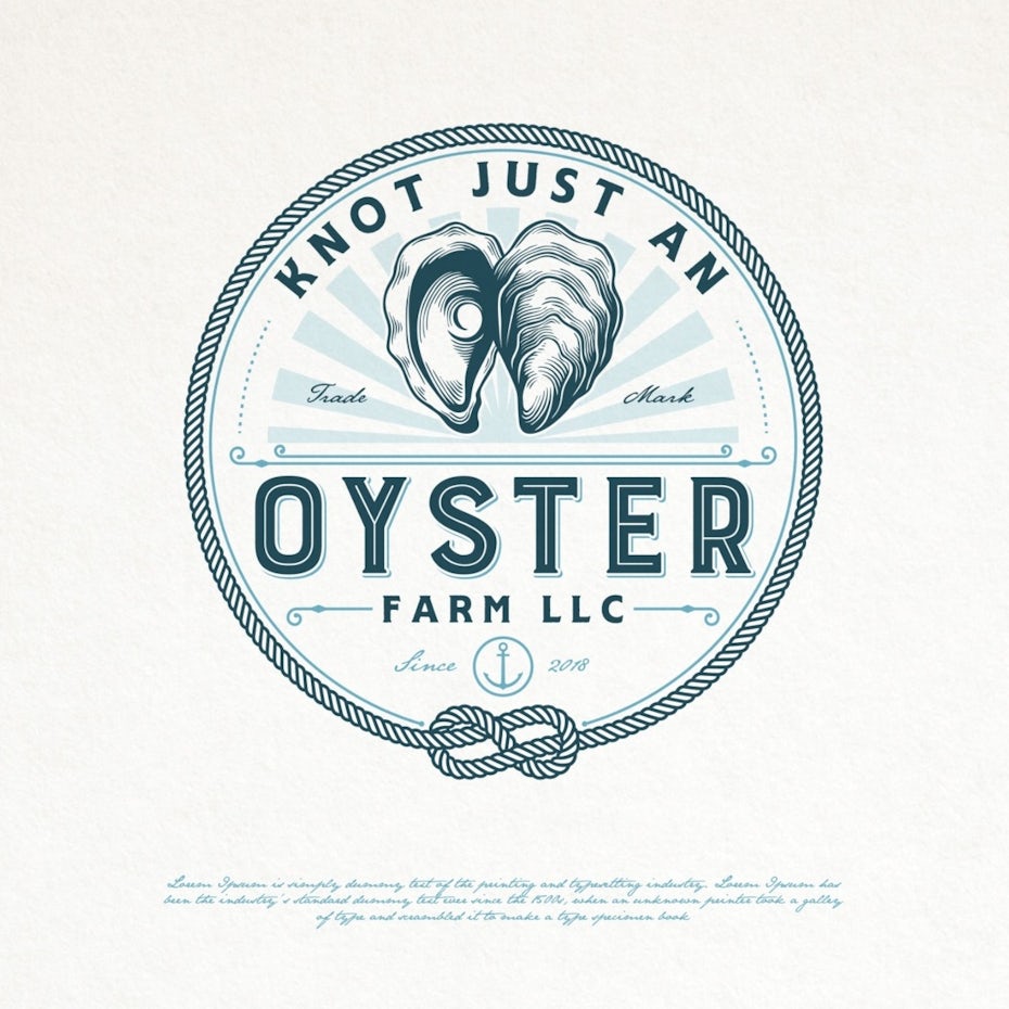
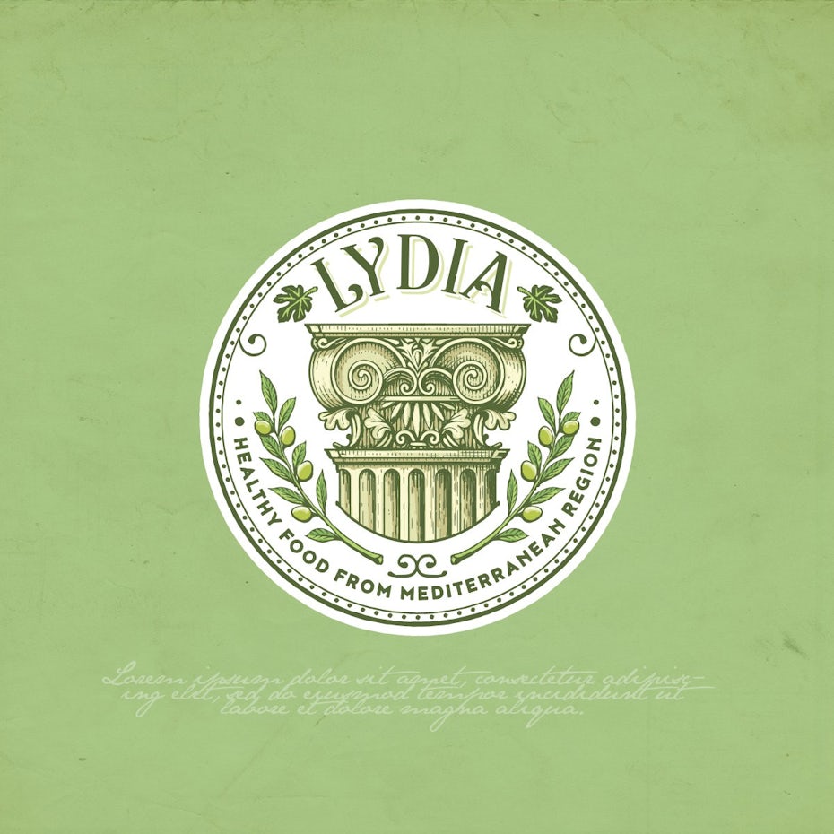
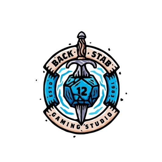
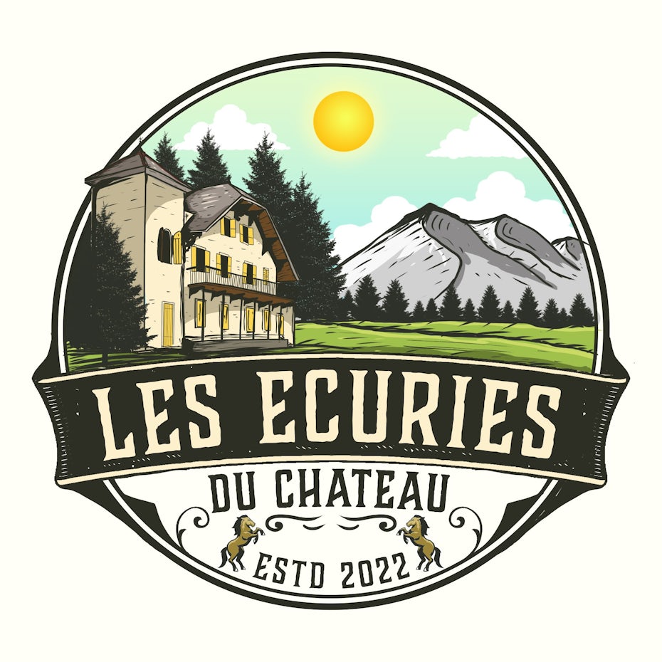
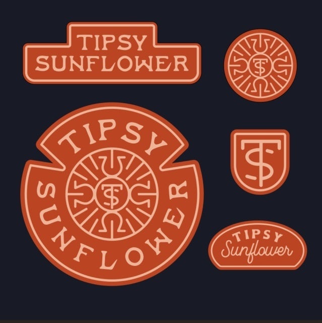
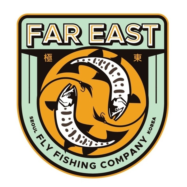
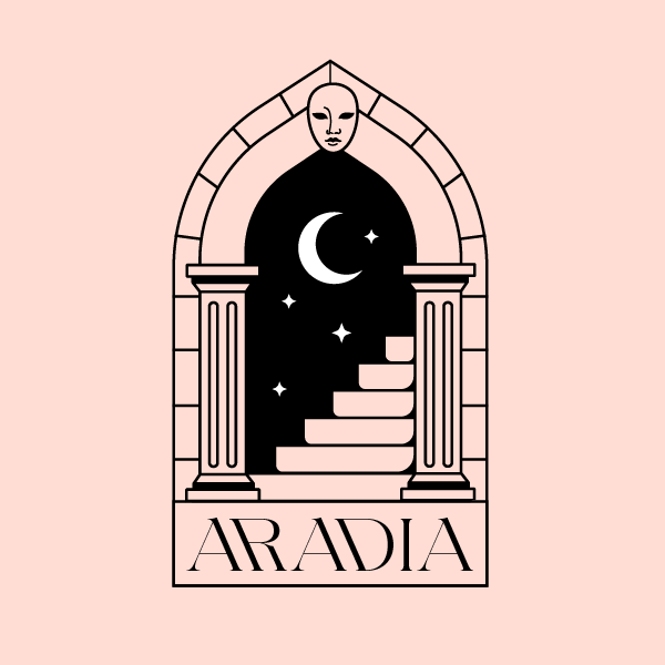
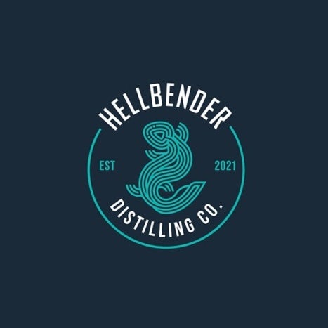
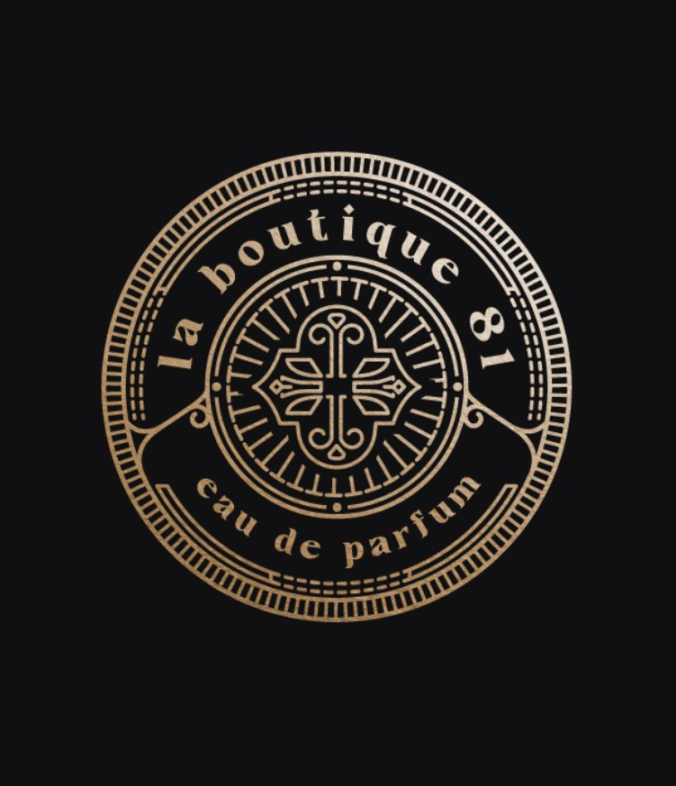
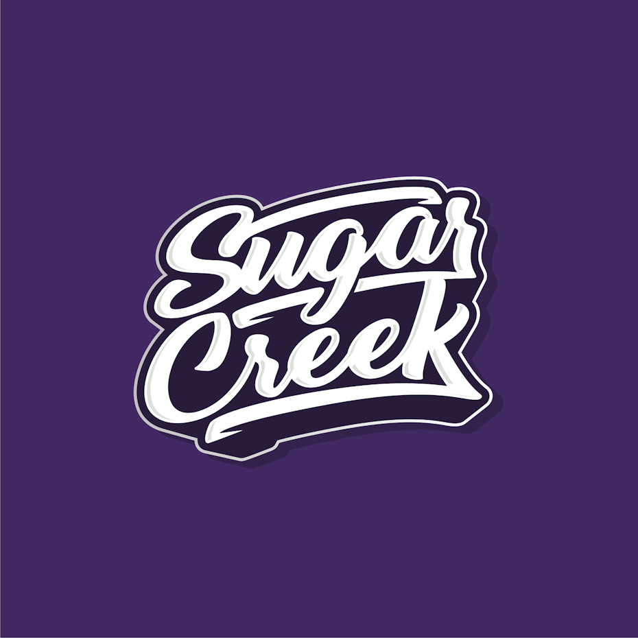
The best emblem logos
—
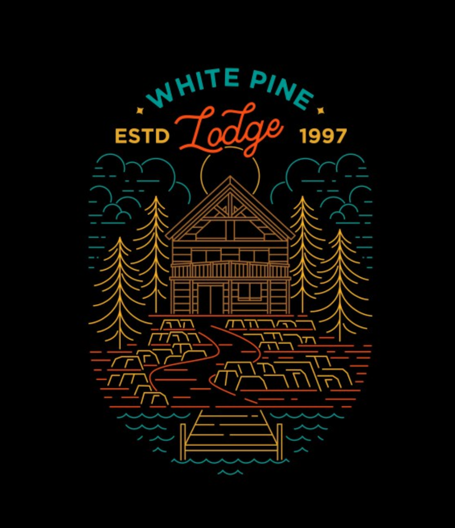
An emblem is a seal, badge, or crest that contains a logo within a literal or implied frame. These logos typically contain more supporting information than is common—such as an establishment date and slogan. Because of that, they can come across as old-fashioned (in a good way, depending on the brand). But despite their historical origins, logo designers still find them useful today. Let’s take a look at both classic and modern interpretations of the emblem logo.
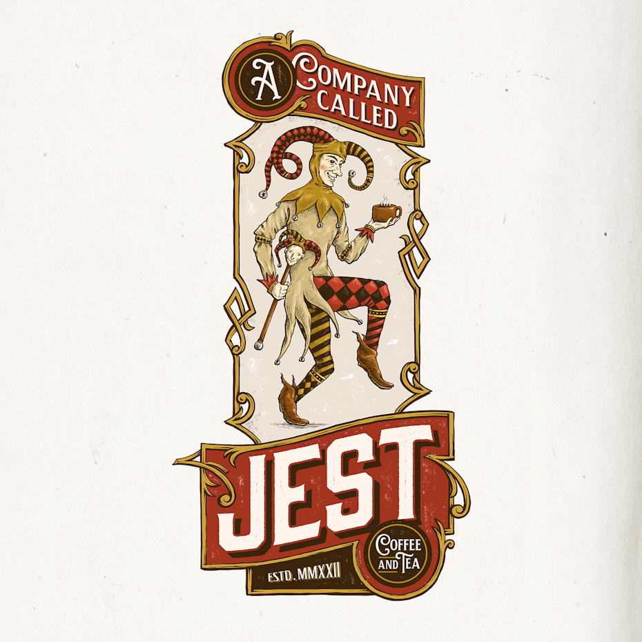
Best vintage emblem logos
The vintage style of emblem tends to be encased in a literal seal and is often more illustrative. Hand-sketching and weathered textures give the impression this logo was drawn by a real person, and it has stood the test of time. The vintage approach continues to be popular with brands that want to emphasize tradition and handmade authenticity.
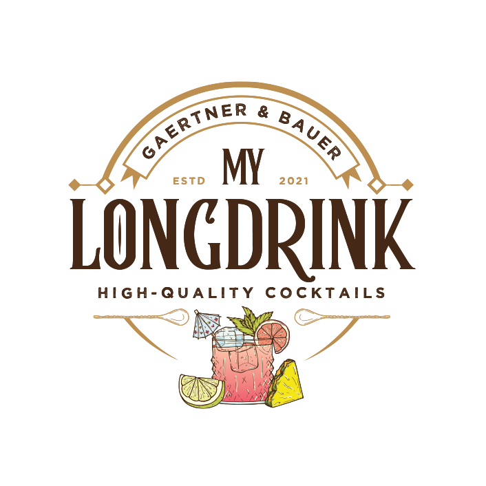
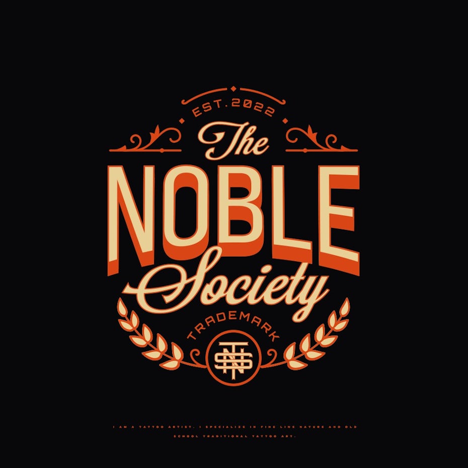
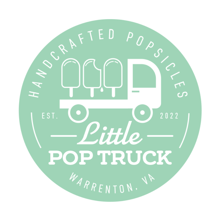
Best modern emblem logos
Modern emblem logos take advantage of digital design advances to reinterpret the old style. These tend to be more minimalistic, include bolder colors and favor geometric precision over hand-drawn techniques. The best part about the modern emblem is that it can suggest a brand’s ties to the past without looking out of touch with the world today.
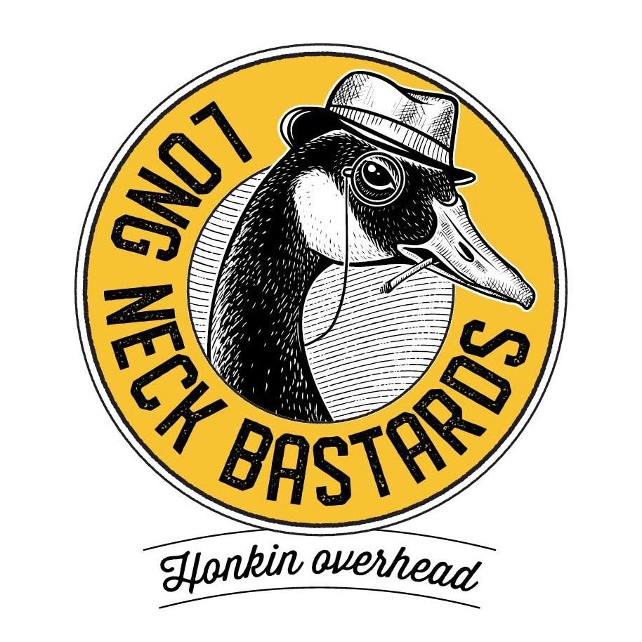
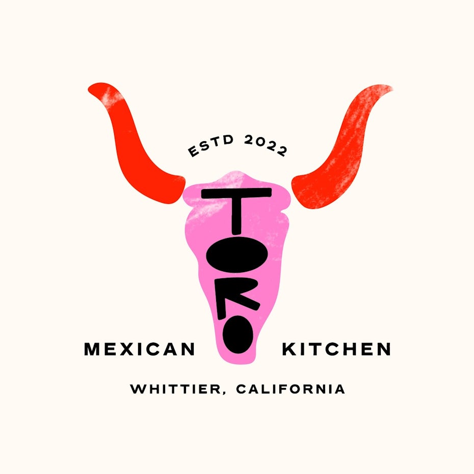
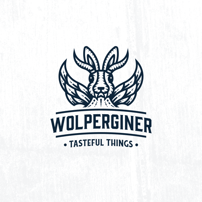
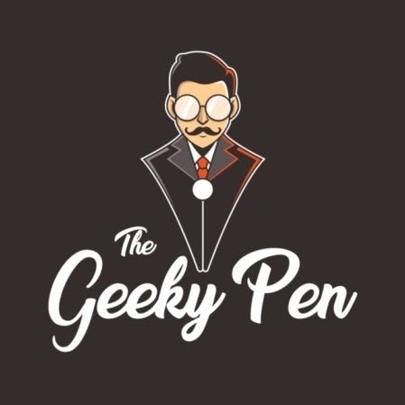
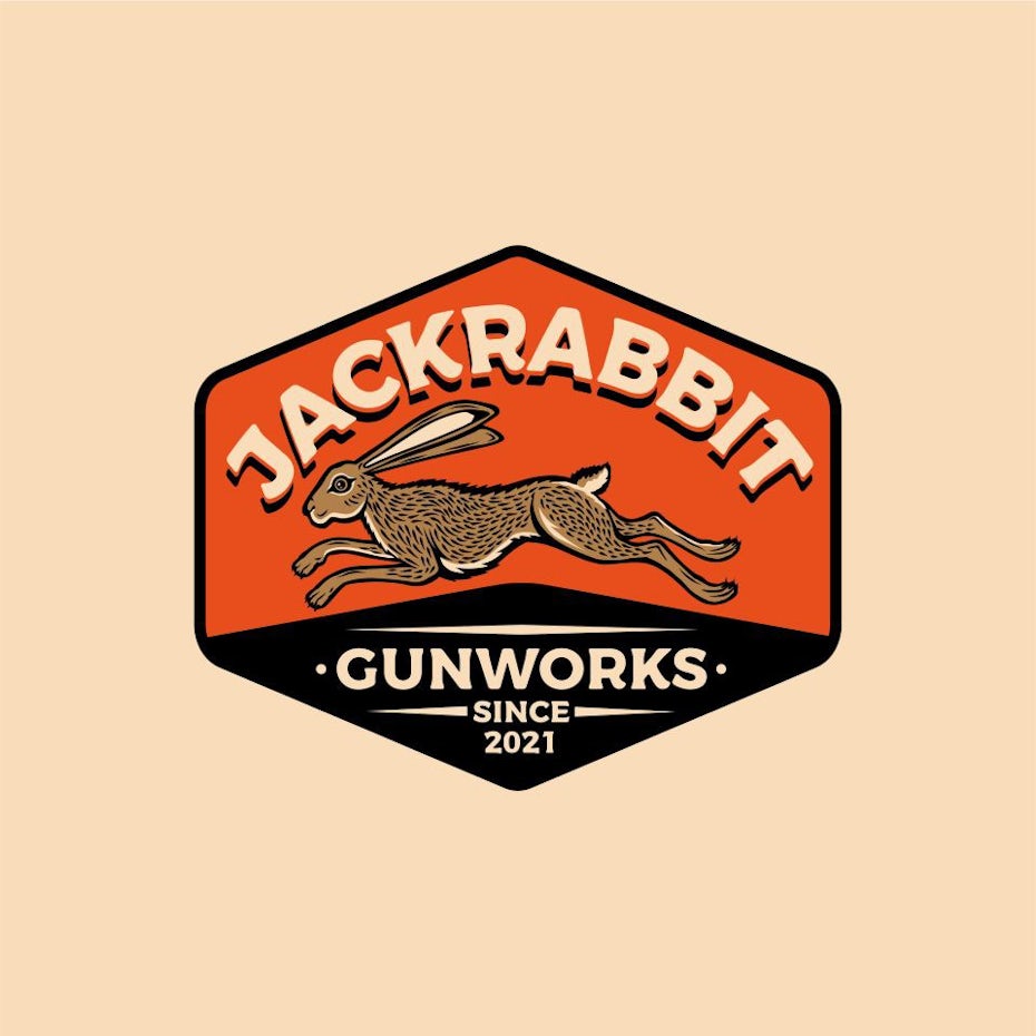
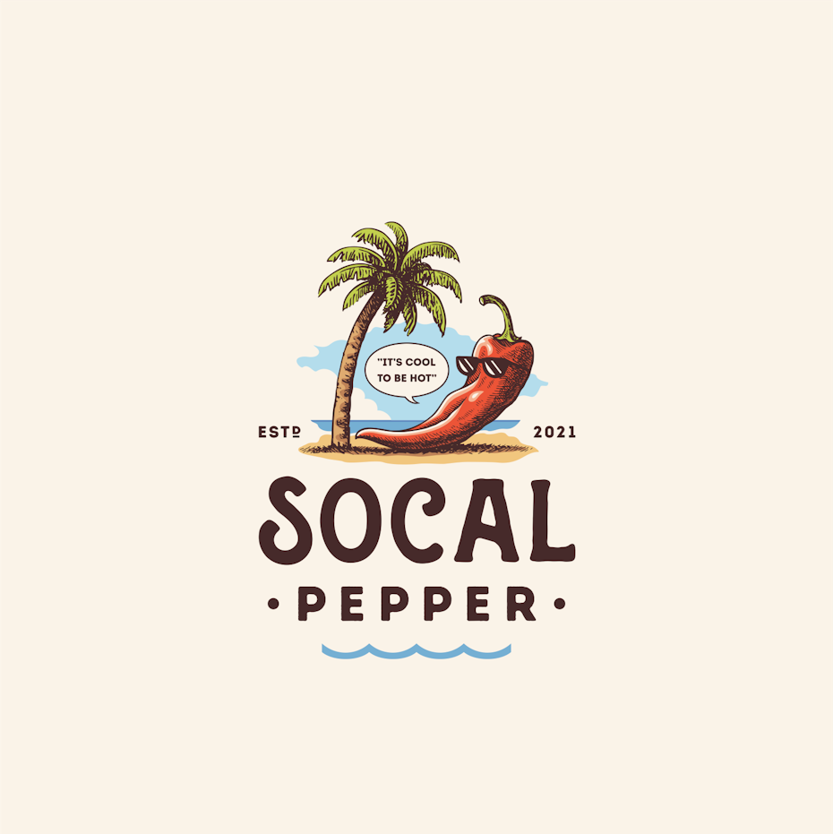
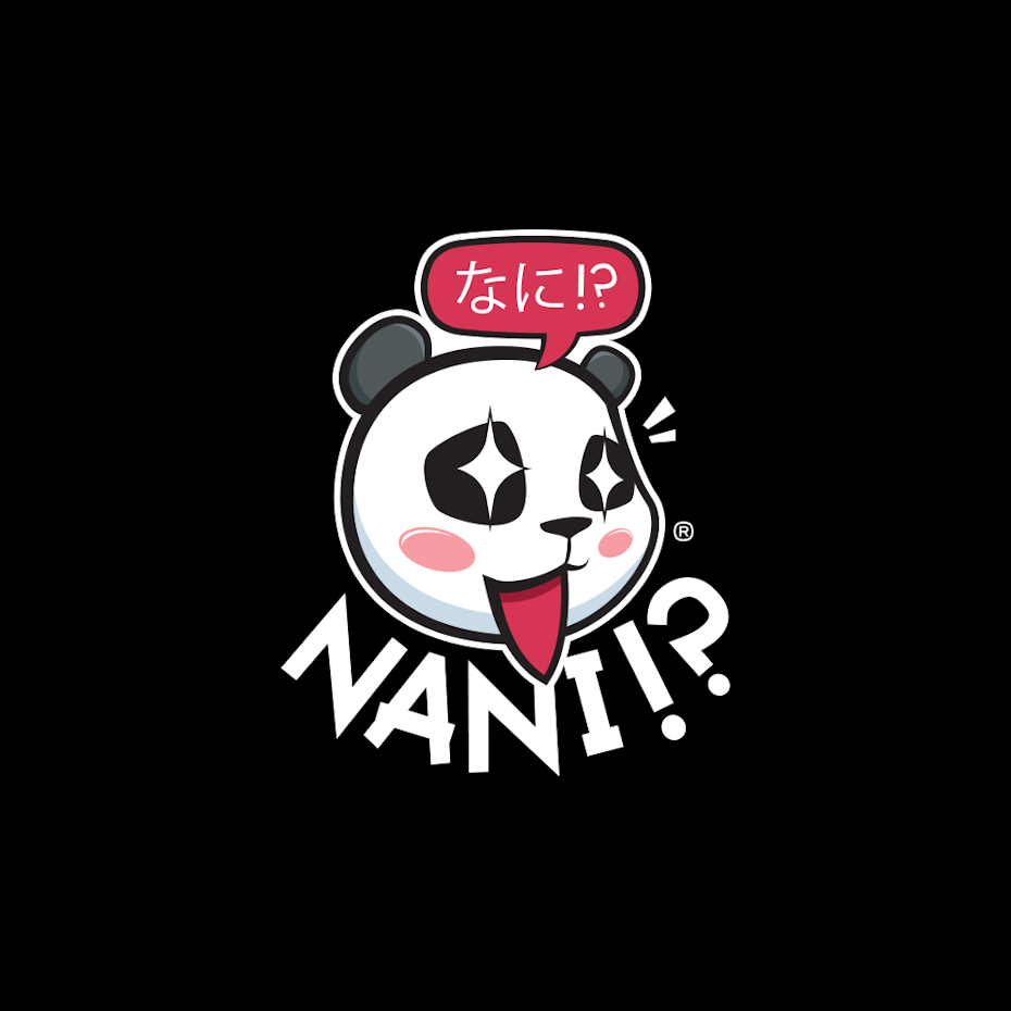
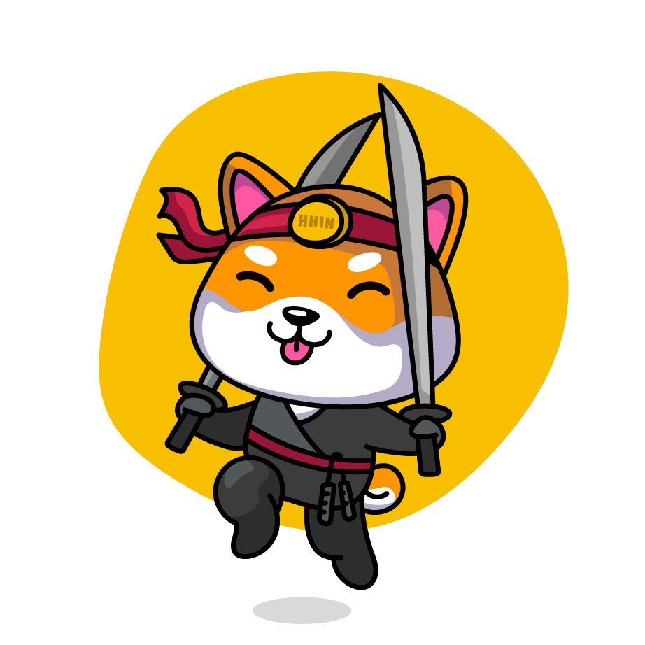
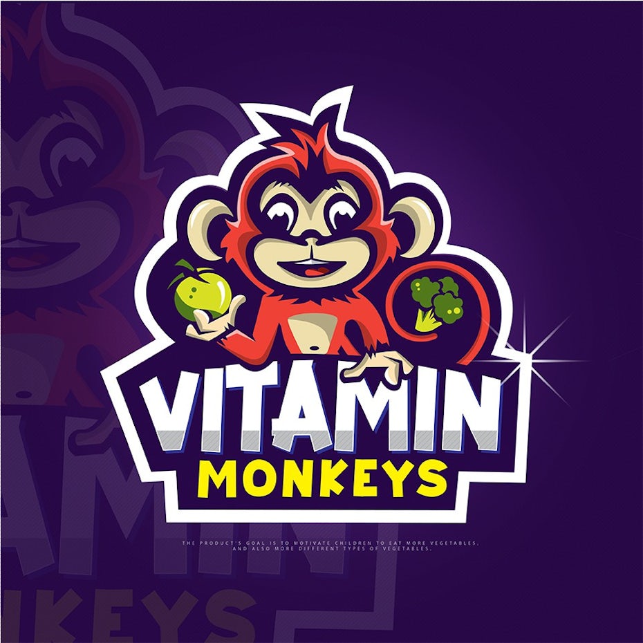
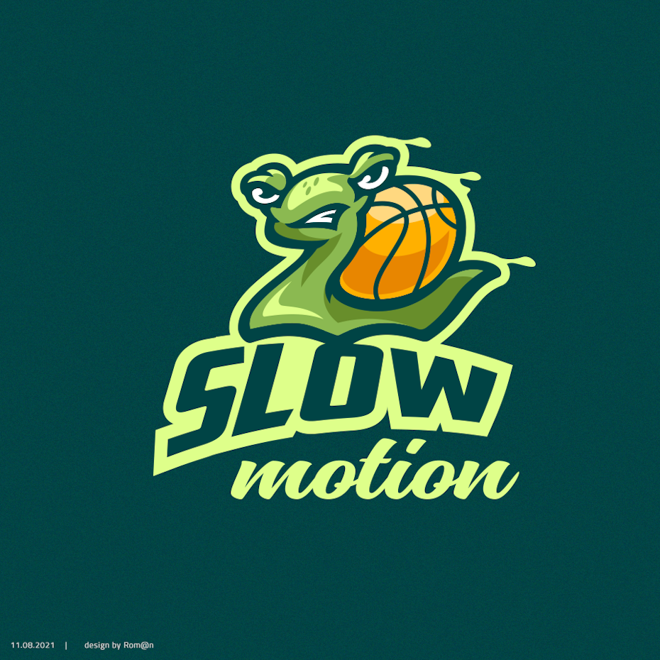
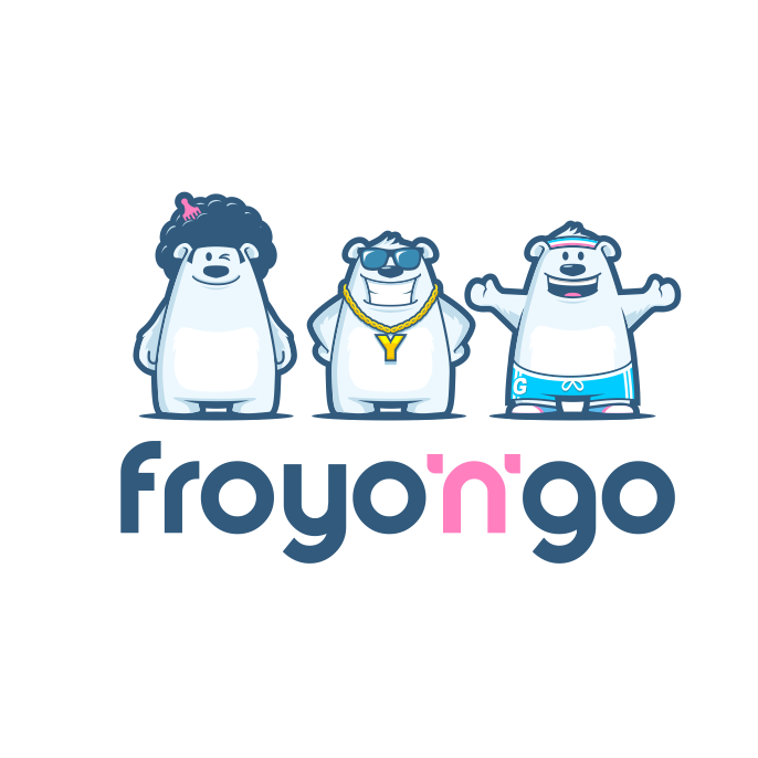
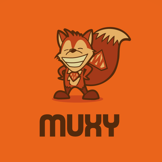
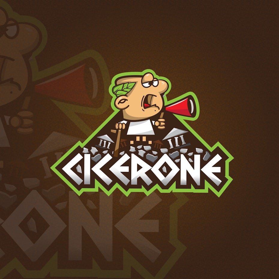
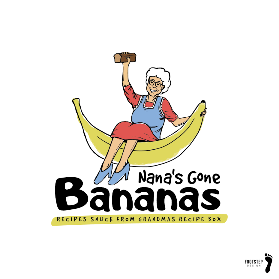
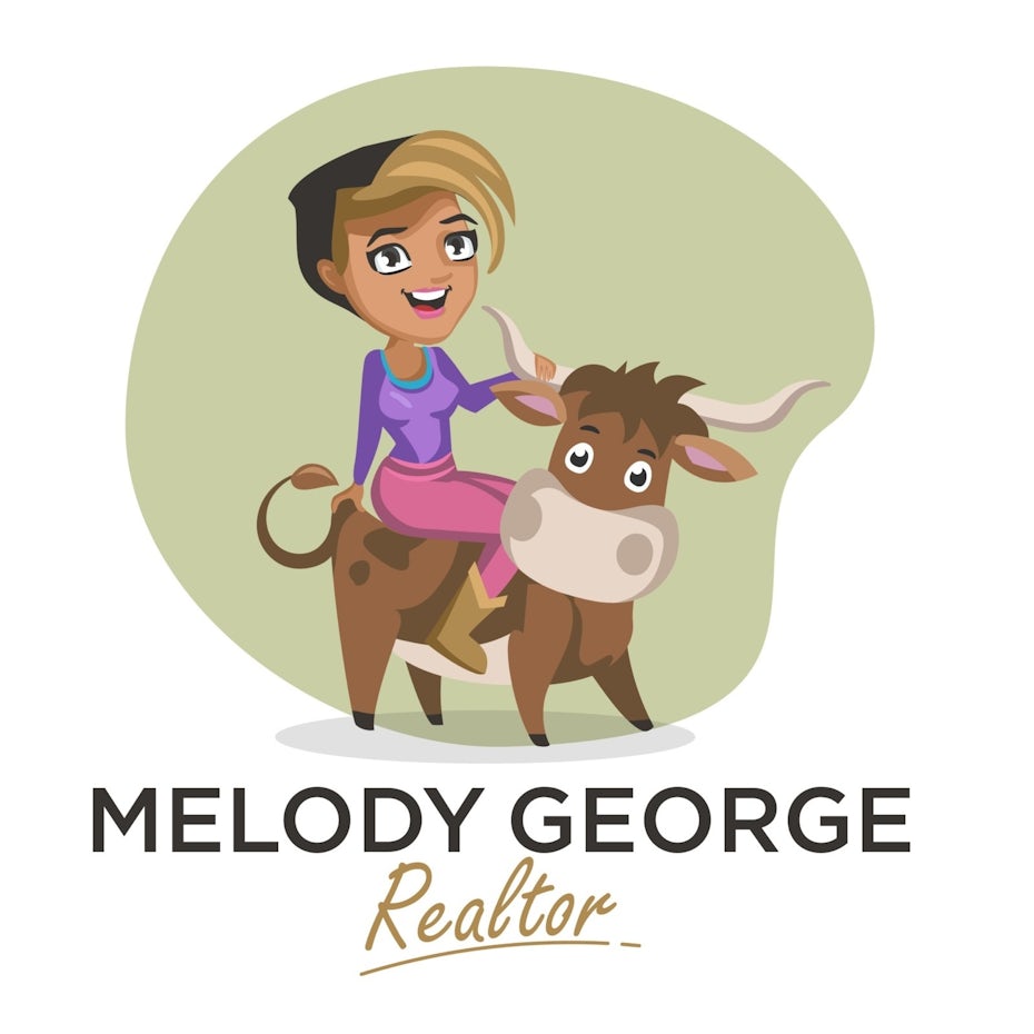
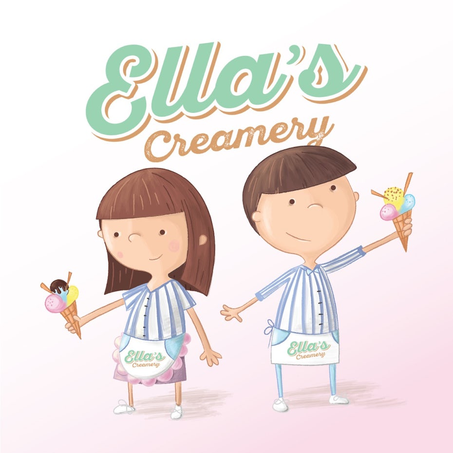
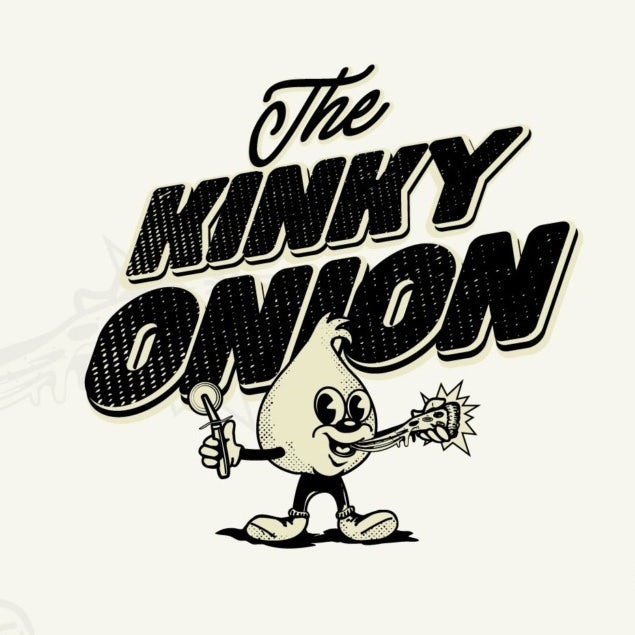
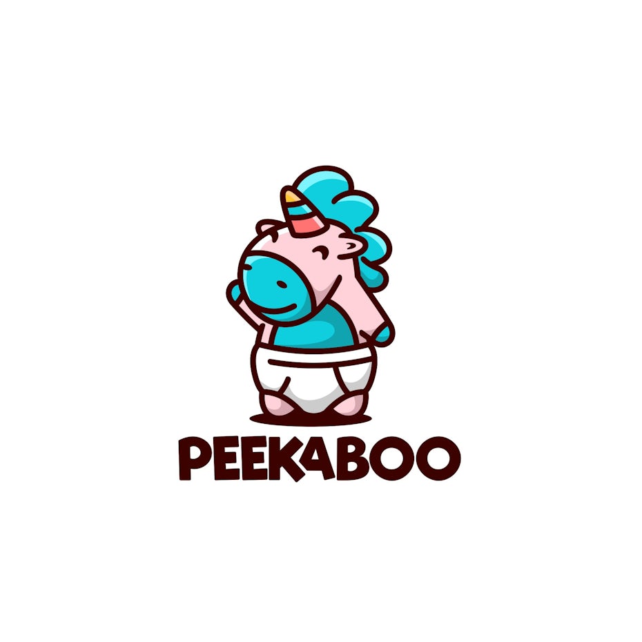
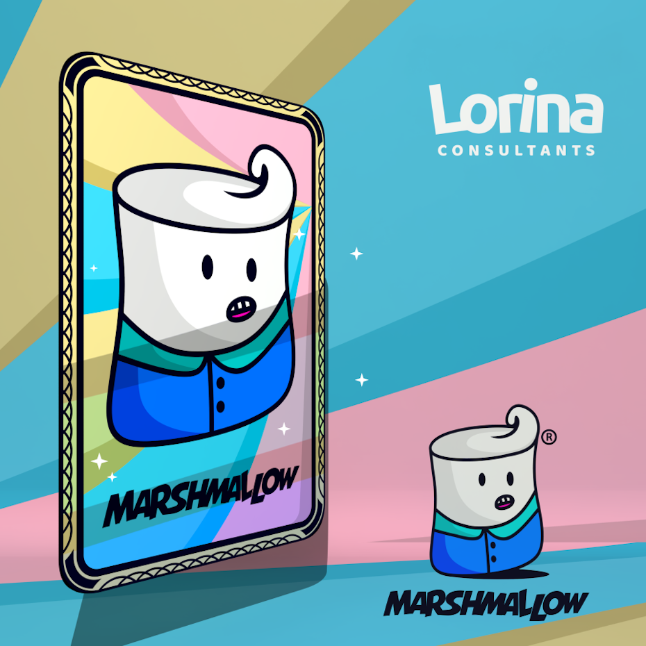
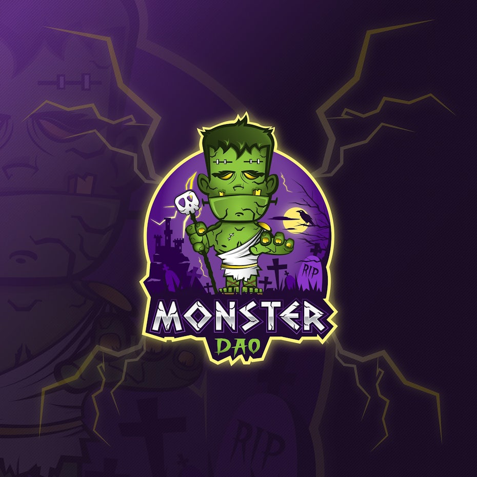
The best mascot logos
—
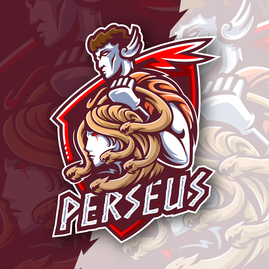
A mascot is a logo that features a distinct character, and as such, it combines the best of both worlds. Not only does a character have an easier time communicating personality traits than a symbol, but it also provides an additional brand asset that can be used outside of the logo—as many mascots show up in advertising and across company websites. The fact that they are separate characters is essentially what separates mascots from regular logomarks. There are three main types of mascot logos to consider.
Best animal mascot logos
These mascots consist of cartoon or caricature animals. As with pictorial logos, animals have symbolism attached to them (think of how a vulture can represent death). So while it can be tempting to pick a certain representative animal because it is cute, it is essential to research cultural associations ahead of time.

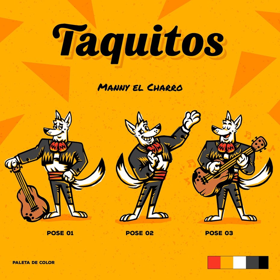
Best human mascot logos
There’s nothing more recognizable than another person. Faces provide a quick win for emotional connection, which is why human characters can be an effective choice for a brand mascot. To get across the right personality traits, be sure to brush up on your character design fundamentals.
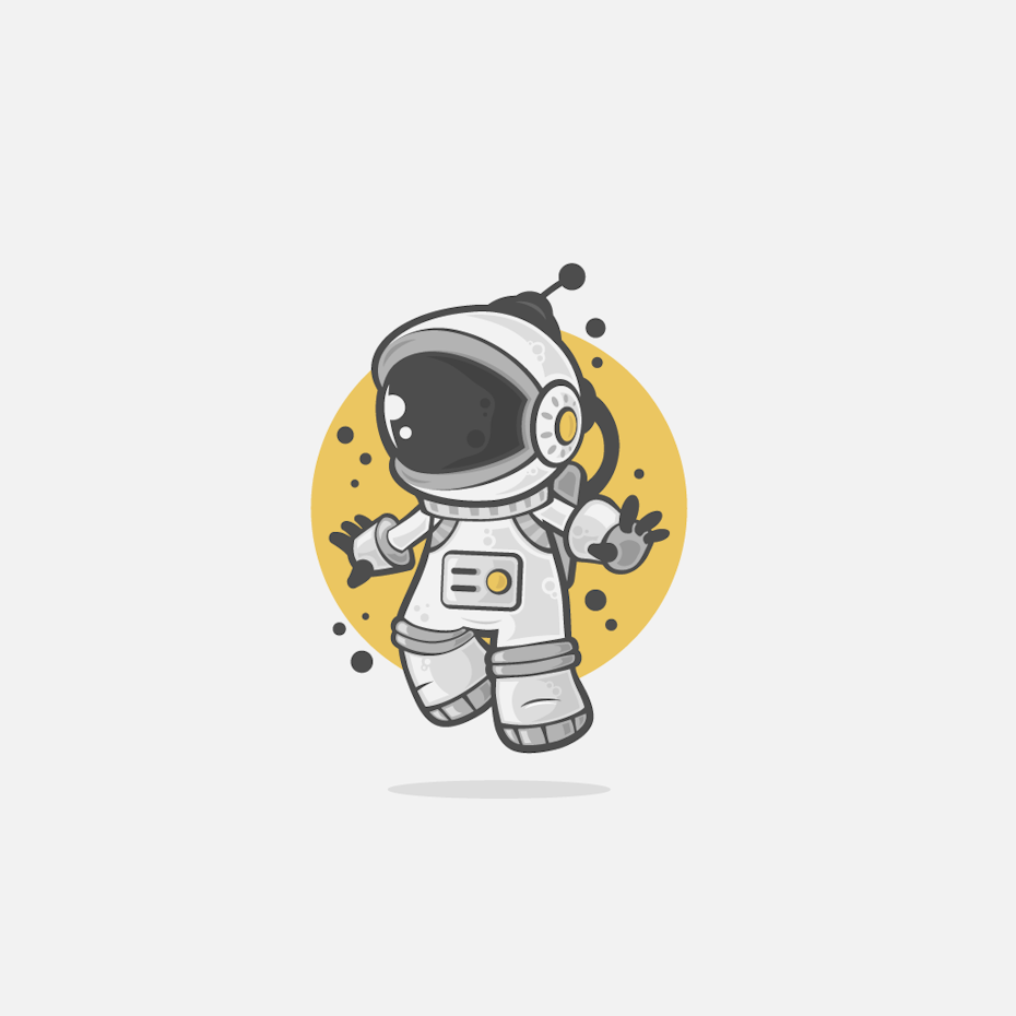

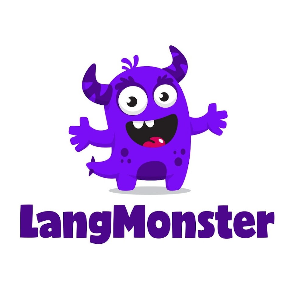
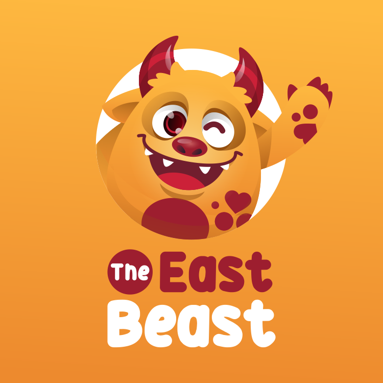
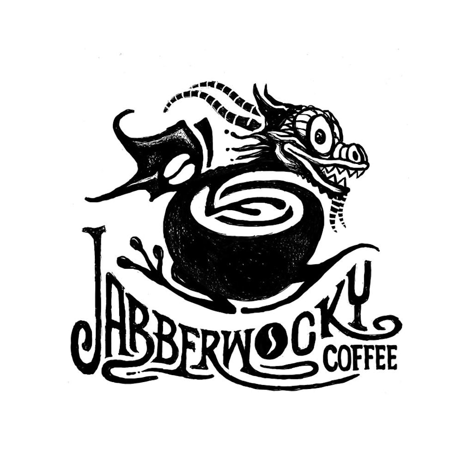
Best imaginary creature mascot logos
Imaginary creature mascots include monsters, aliens, and everything in between. While most mascot designs tend to go for a humorous style, imaginary creatures will inevitably dial that up, solely by their sheer weirdness. But that can be useful when you need to embody extra fun and charm for an audience.
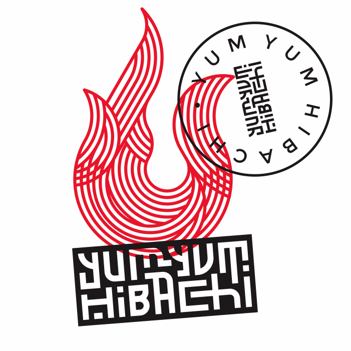
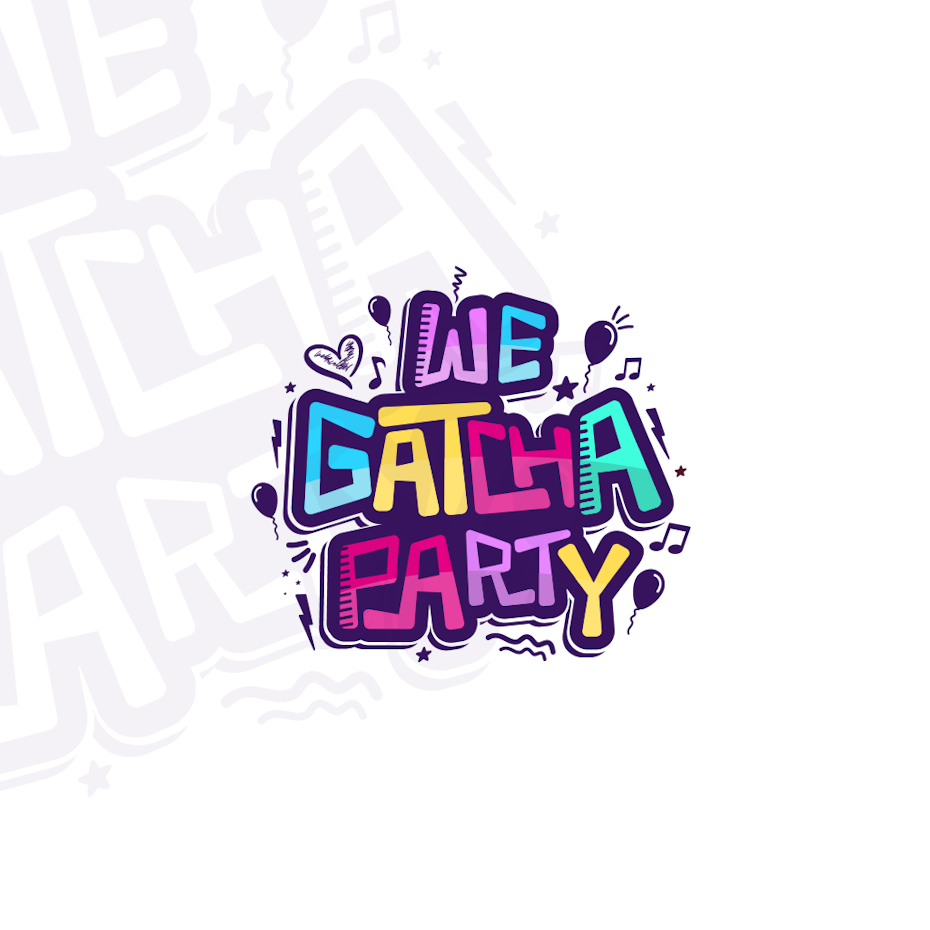
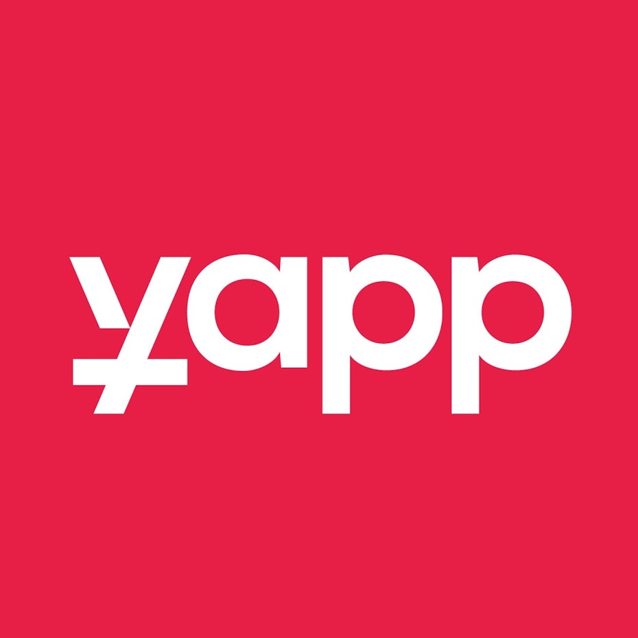
The best font logos
—
Typographic logos are all text without an accompanying logomark or icon. These make the brand name a work of art all on its own. Though they can be based on a specific font, many typographic logos are fully custom as well. There are two main logo varieties, involving the initials of a brand (sometimes called lettermarks) or the whole name (sometimes called wordmarks).
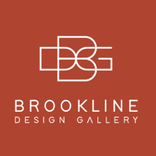
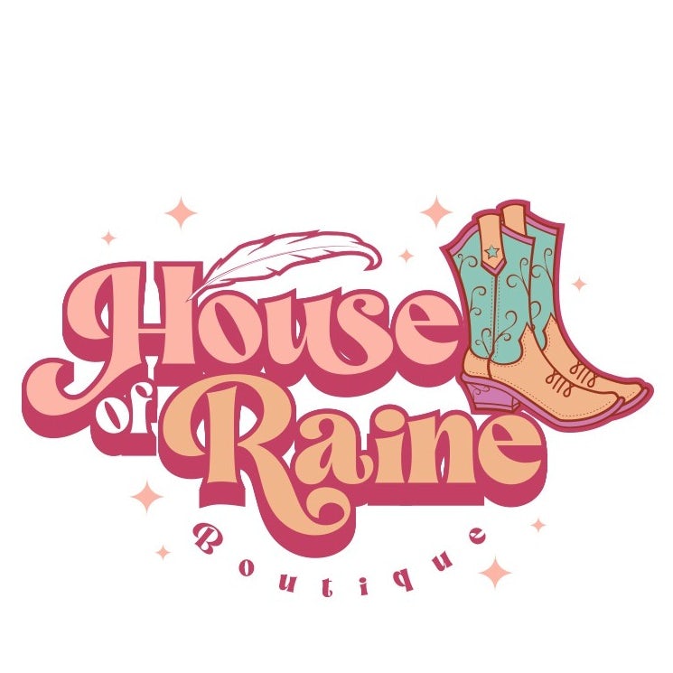
Best monograms and initials
Monograms allow you to have your cake and eat it too: these logos are entirely made out of text, yet they also double as a symbol based on how the initials are arranged. Monograms are often creatively intertwined into a recognizable mark, but it is equally valid to display the initials in a standard left-to-right fashion.
![Monogram initials logo design for a restaurant]](https://99designs-blog.imgix.net/blog/wp-content/uploads/2022/06/attachment_128912759-e1657269597279.jpeg?auto=format&q=60&fit=max&w=930)

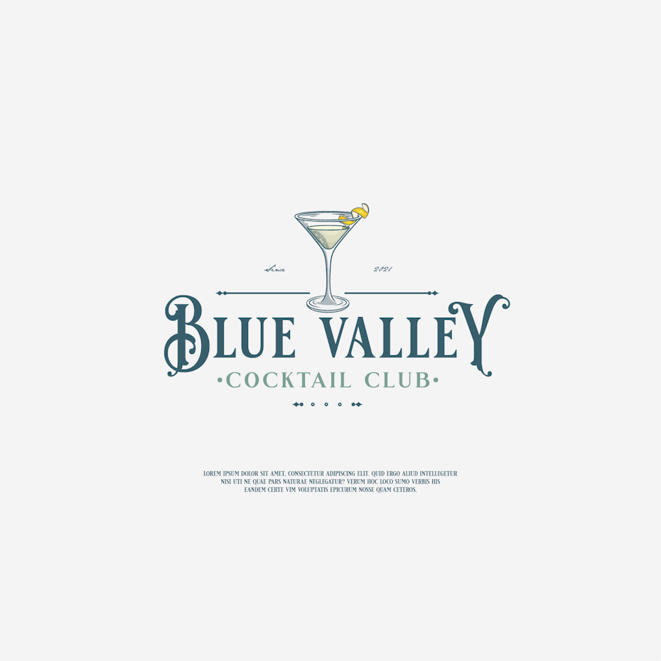
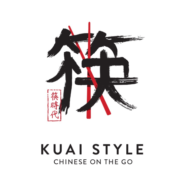
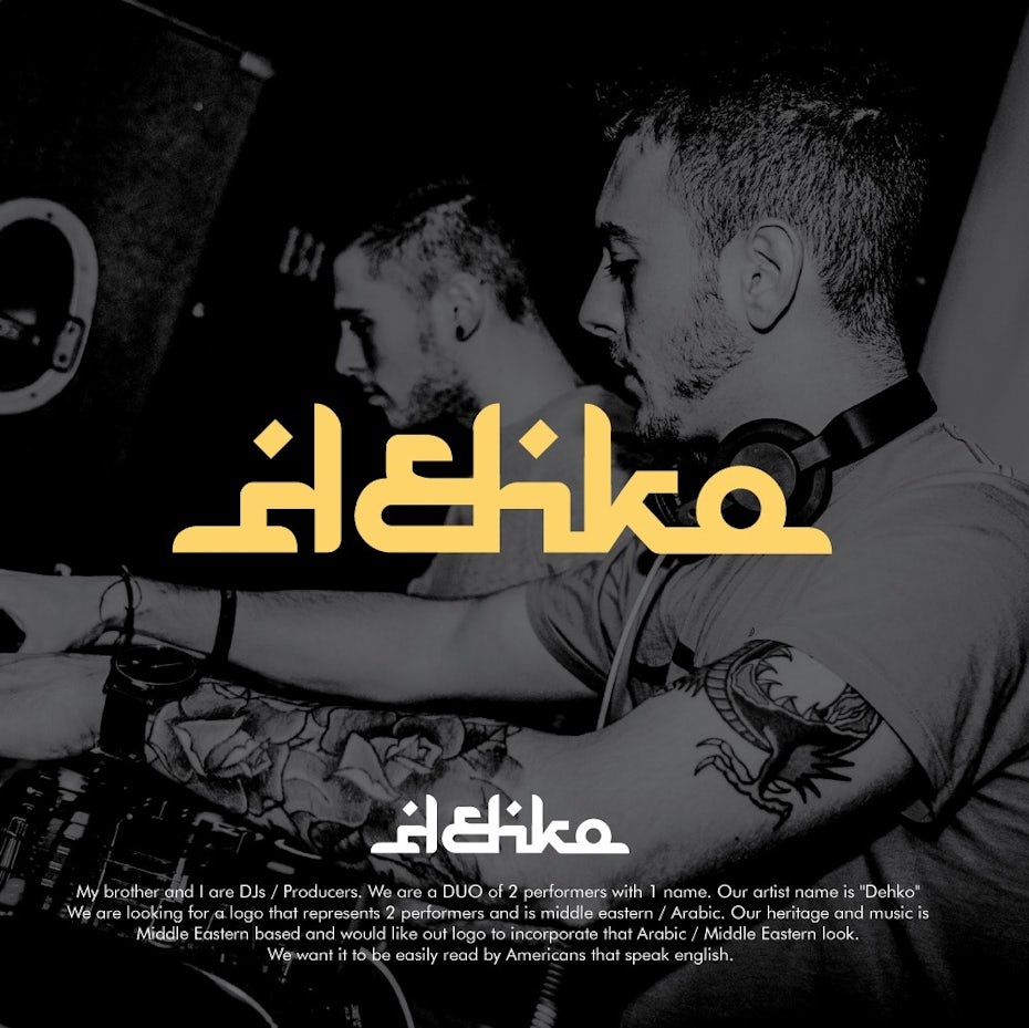
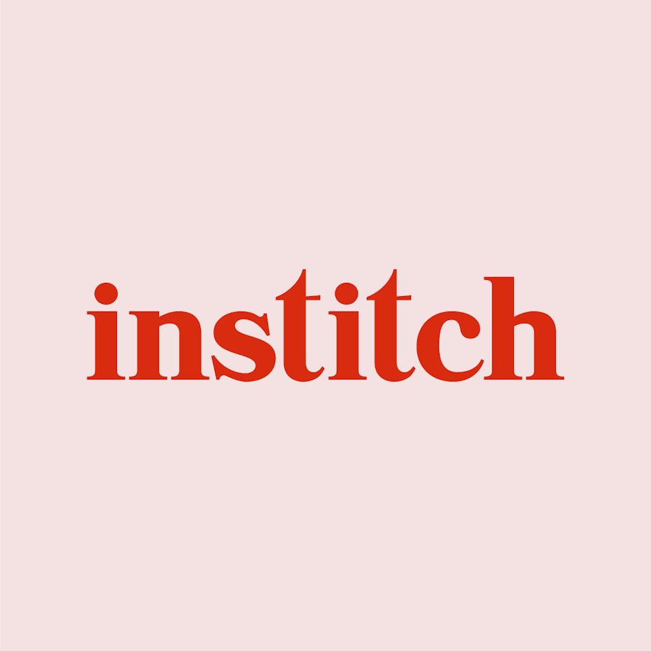
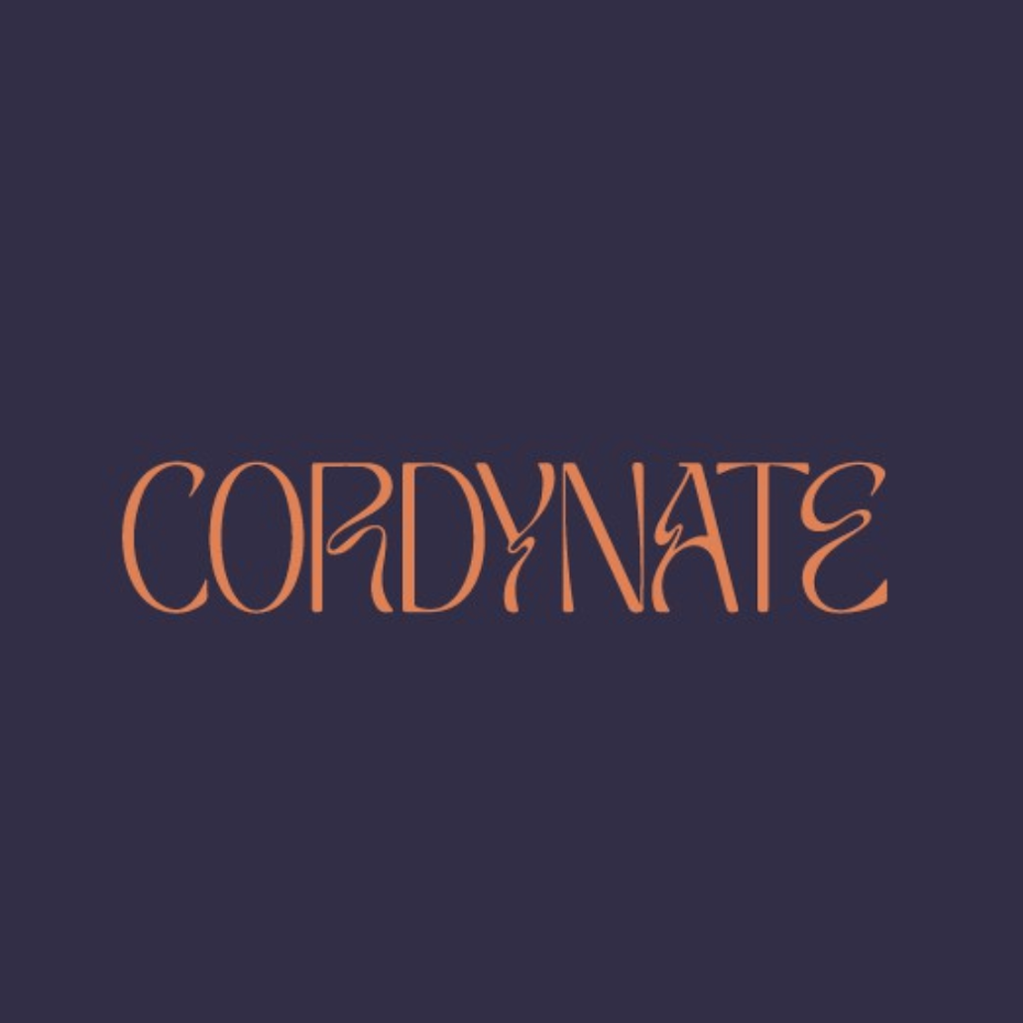
Best wordmarks and lettering
Wordmarks are all about detail. Done lazily, they are simply fonts. But done well, they are nuanced and sleek, and create meaning through typography. These types of logos have a reputation for being more traditional, but they can be creative and quirky. Lettering, after all, is its own design discipline, and these examples show that a letter-based logo can be just as emotive as a picture.
The best logos of all time
—
What constitutes the best logos of all time is a contentious topic. After all, there are so many businesses around the world and so many logos being designed every day to represent them. In short, there are many winners in this arena. And yet, there are some logos that always come up time and time again in these best-of conversations. What the following logos have in common is the way they have stood the test of time, either by the iconic designers who created them or through an effective rebranding campaign. With all that said, here are some of the best of each type of logo.
The most iconic logos
- The classic IBM lettermark logo
- The FedEx wordmark logo
- The “I Love New York” logo
- The KFC mascot logo
- The Starbucks emblem logo
- The combination Adidas logo
- The combination Toyota logo
- The abstract shapes of the Mastercard logo
- The Chanel monogram logo
- The Citibank logo
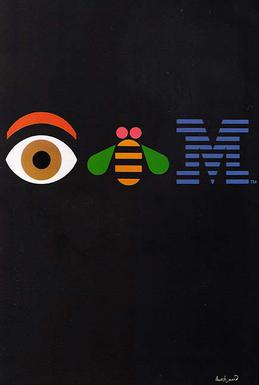
The classic IBM lettermark designed by Paul Rand uses thin lines to represent the speed and efficiency of their computers. The company has since embraced Rand’s vision for a playfully versatile design by incorporating a number of variations to the lettermark into its official logo style guide.
Lindon Leader’s classic FedEx wordmark logo is famed for its hidden arrow between the “e” and “x,” referencing the fact that the company ships packages.
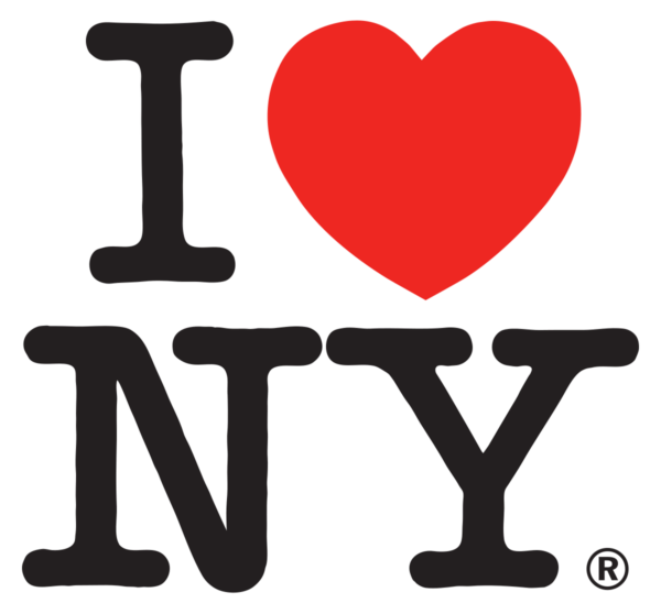
There are many cities around the world producing touristy merch, but few are as iconic as Milton Glaser’s 1976 “I Love New York” logo. It was so successful in its time that it was incorporated into the state’s official slogan and anthem.
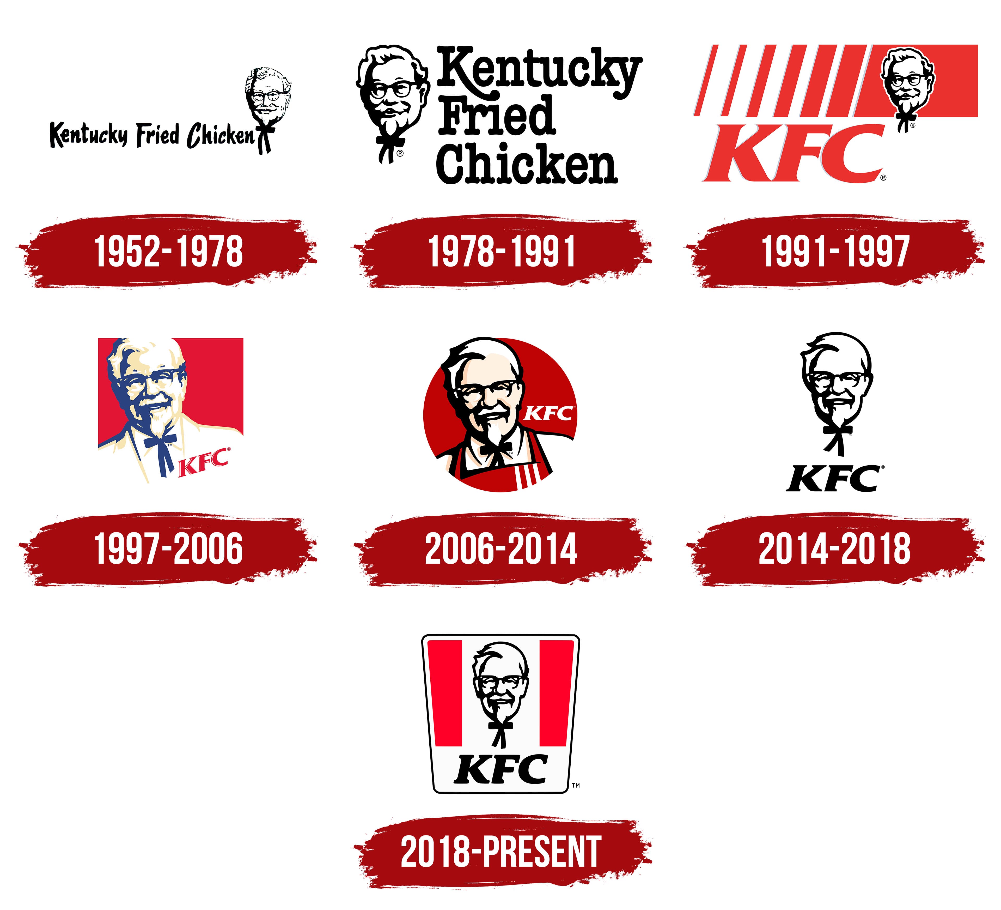
The Colonel represents one of the most well-known mascot logos in the world (from America to Japan), despite several redesigns over the years to keep him looking modern.
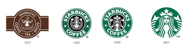
The Starbucks emblem is another one of those that has retained a strong consistent identity despite rebrands to keep up with the changing times. These days, the smiling mermaid’s split fins enclose the seal in an inviting circle of perfect symmetry.
Although the famous abstract stripes of the Adidas logo were born out of the stripes they used to reinforce their early running shoes, they drew further meaning out of this, tilting them to represent overcoming a mountain. In so doing, they tied the physicality of their product to the vision of the brand.
The Toyota logo combines meaning with abstraction. With concentric ovals representing the customer and company coming together, the logo also forms a stylized uppercase “T.”
The Mastercard logo has done such a great job cultivating a recognizable identity over the years that its most recent rebranding removed the company name entirely, relying solely on abstract concentric circles.
The Chanel monogram is a great embodiment of classical elegance, with simple intertwining C’s that feel sparse and orderly. Although the brand is known for luxury products, this is a monogram that is confident without showing off.
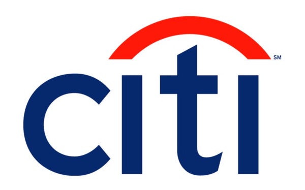
Legendary designer Paula Scher famously created the Citibank logo on a napkin in under ten minutes, and this is exactly what she presented to the company, saying that they would be purchasing her 20 years of experience distilled into ten minutes. They bought it for $1.5 million dollars and use the logo to this day.
Get inspired with creative logos
—
The best logos come down to inspiration. They are born from the mind and skill of a designer, inspired by a company’s mission to create something that will live up to the brand. And once a logo is created, it can in turn inspire a brand’s customers, sometimes without their even realizing it. In short, the best logos are more than pictures or pretty symbols that you stamp on a to-go bag. They are a brand that comes to life.
This article was originally written by Kelly Morr and published in 2017. It has been updated with new examples and information.


