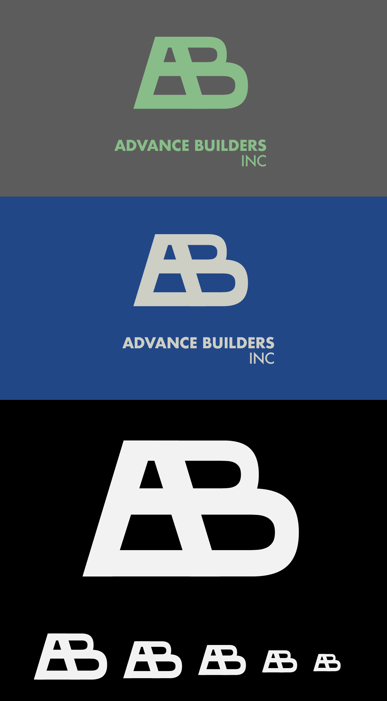

Logo for a construction company specializing in concrete and masonry out of Brooklyn. The company has been in business for the past 20 years so the design had to represent this extensive experience and expertise in a visual format. This mark was the result of many rounds of iteration where I played with the letters A and B to form a cohesive and modernist shape. I then reworked the shape to optimize balance, proportions and overall dynamics to come up with this final design. Since it is vector based and built to pixel perfect specifications, this logo mark is infinitely scalable and can be used with or without the subtitle (Advance Builders Inc). It works in a vast array of different contexts including web, business cards, merchandise and advertisements.