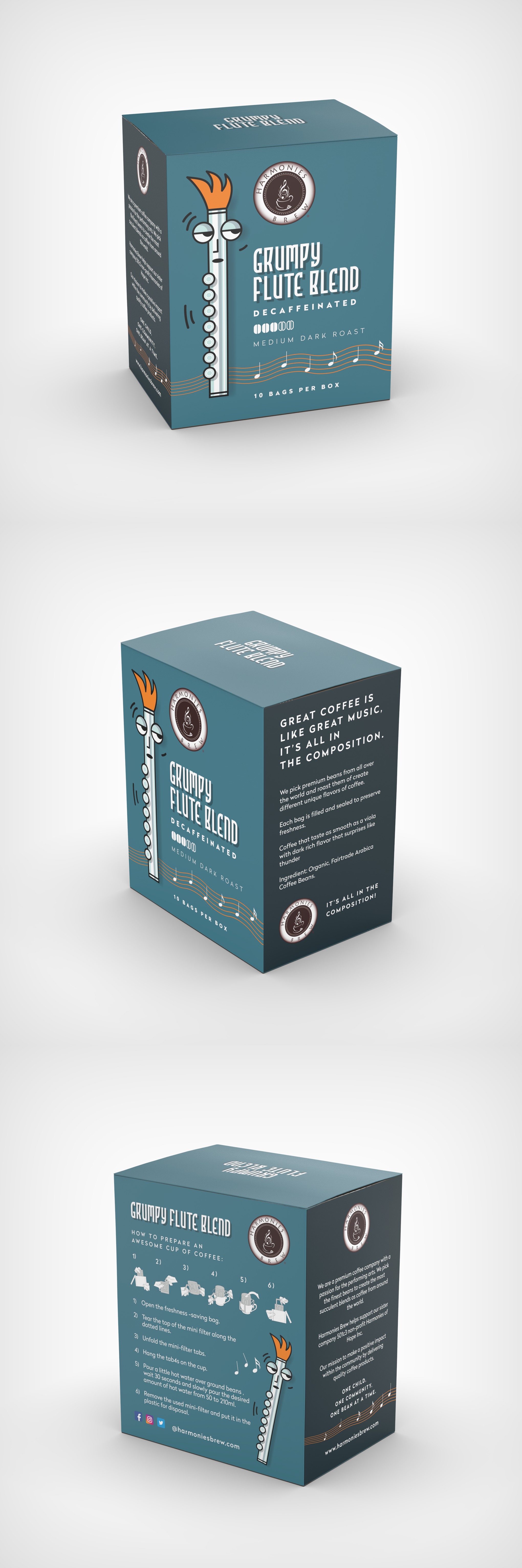
Grumpy Flute Coffee Packaging

2
Created on 99designs by Vista
Unfortunatelly - not a winning design, didn't make to the final round either. However - I thought the product name was very inspiring and I thought the grumpy flute illustration I created looked humorous and engaging. Client asked for blue/aqua colors to be used, so I did, but since the flute is in cold colors - a complementrary warm colored background would make it pop more. Since I'm happy with the flute character used here - I decided to add this draft to my portfolio.