
Sito is a real estate development company.
How do we design the Sito icon?
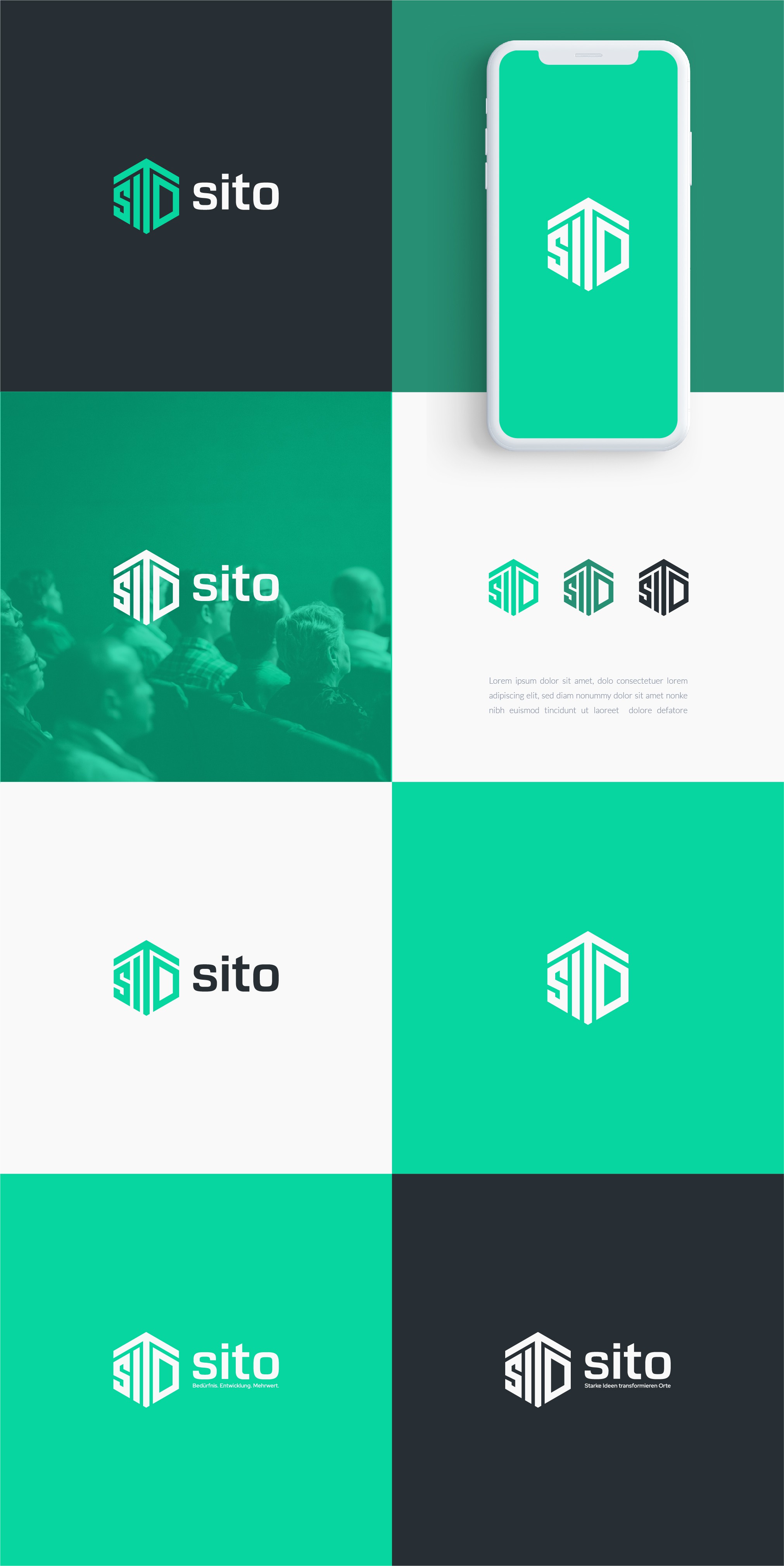
We make the Sito icon is uniquely and beautifully shaped, the T on the Sito icon is made to resemble an arrow pointing up indicating something that will progress and develop as a representation of company in the future.
The Sito icon is also very likely to stand alone without a name because the Sito icon is unique by directly forming the Sito company name only through a beautiful icon.
Sito icon will be easily recognized and become a timeless icon.
The sito icon that directly forms the name can also be a hidden message, namely the ability to analyze and plan is proven by analyzing and planning to create potential in creating and compiling a unique icon that forms the company name.
Typography : The font uses a handmade font designed to follow the Sito icon style.