Fresh logo for fitness and healthy food

0
Created on 99designs by Vista
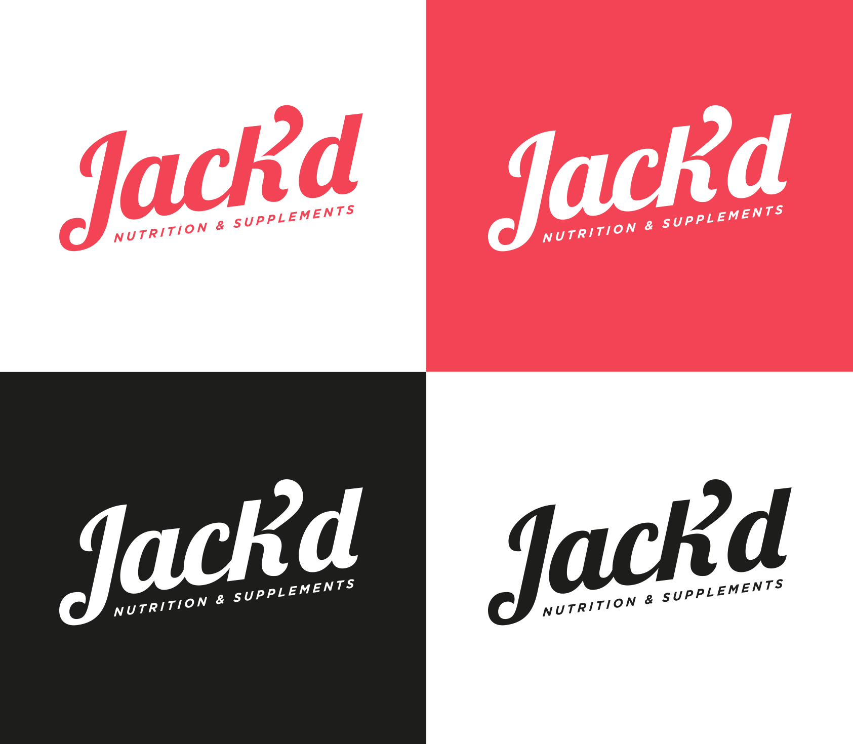
The logo is fresh and funny, but also professional and elegant. The second part of the K works both as the arm of the K and as the apostrophe, and it represents the strength and movement!