
Created on 99designs by Vista
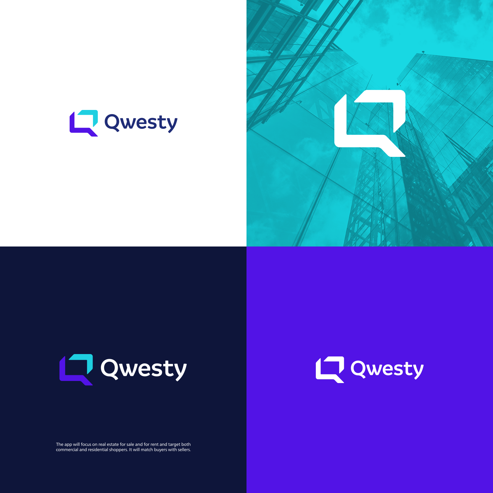
The logo uses the initial letter "Q" to create a shape of simple, modern and stylized lines that convey modernity and technology. A futuristic and disruptive look at the management of the real estate business, the letter "Q" simulates a PC or cell phone screen, the light blue piece is an arrow pointing up as a symbol of growth, development, sales and also of In a subtle way it represents the roof of a house.