
Created on 99designs by Vista
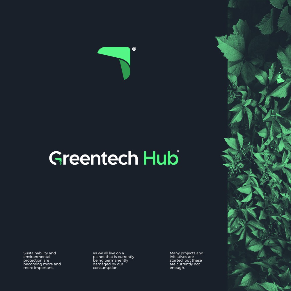
I made a G with an arrow like a refreshed shape that represents the company's identity as environmental care. The arrow in G can be a logo icon.
The arrows can also be interpreted as something positive, always moving forward, which is same as the company's vision, that is to bring people together and encouraging them to participate.