
Created on 99designs by Vista
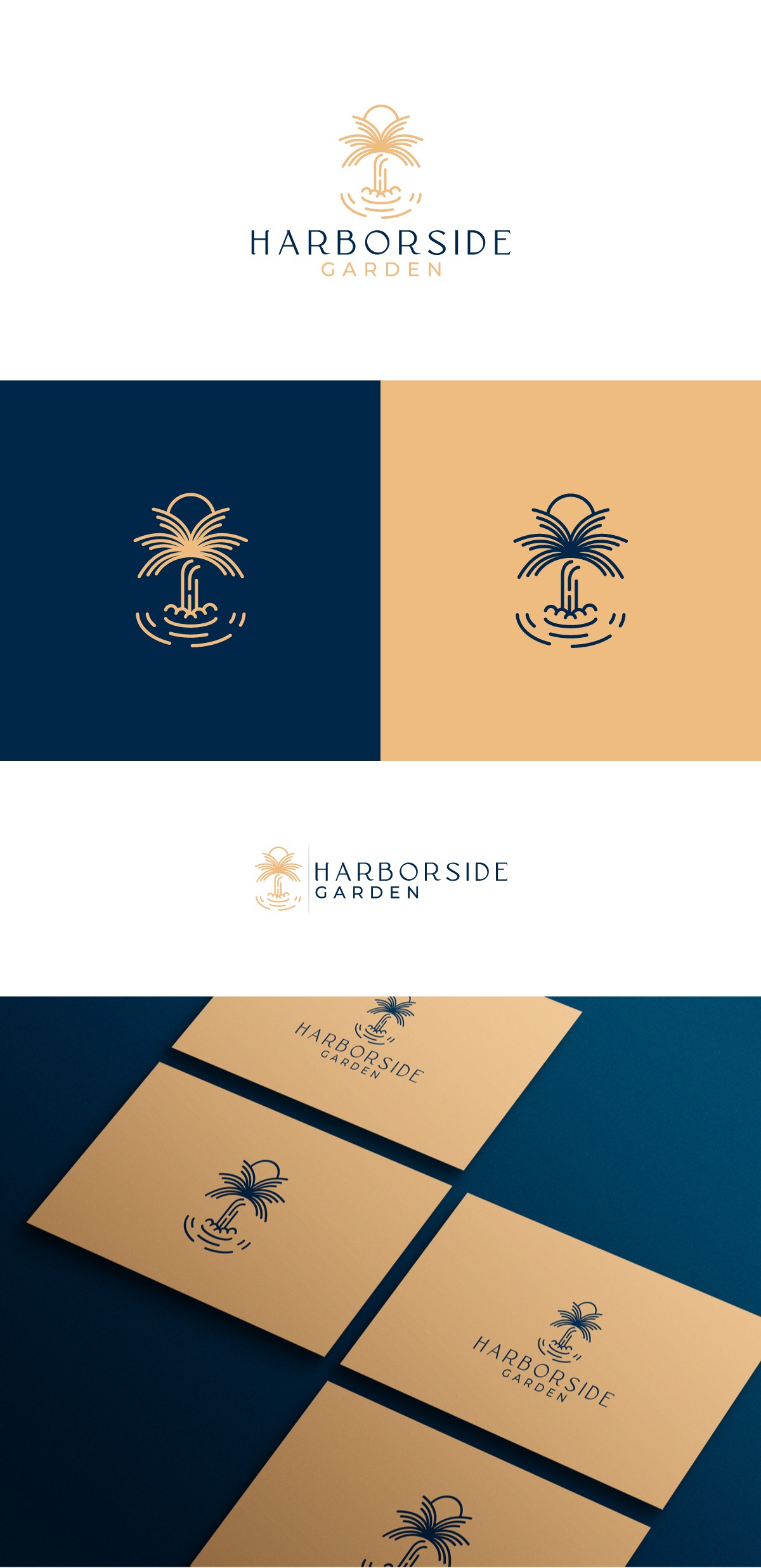
The client approached me with a wish to brand their 3,500 sf waterfront pavilion. They loved my previous work that was shown in my portfolio and they needed it to be modern, simple and luxurious.
The elements the client wanted to have in the logo were palm trees, sun, waterfall and open water. So that is what they actually got in their logo plus a subtle H letter in the waterfall that stands for HARBORSIDE, everything fitted perfectly for them and their brand :)