
Created on 99designs by Vista
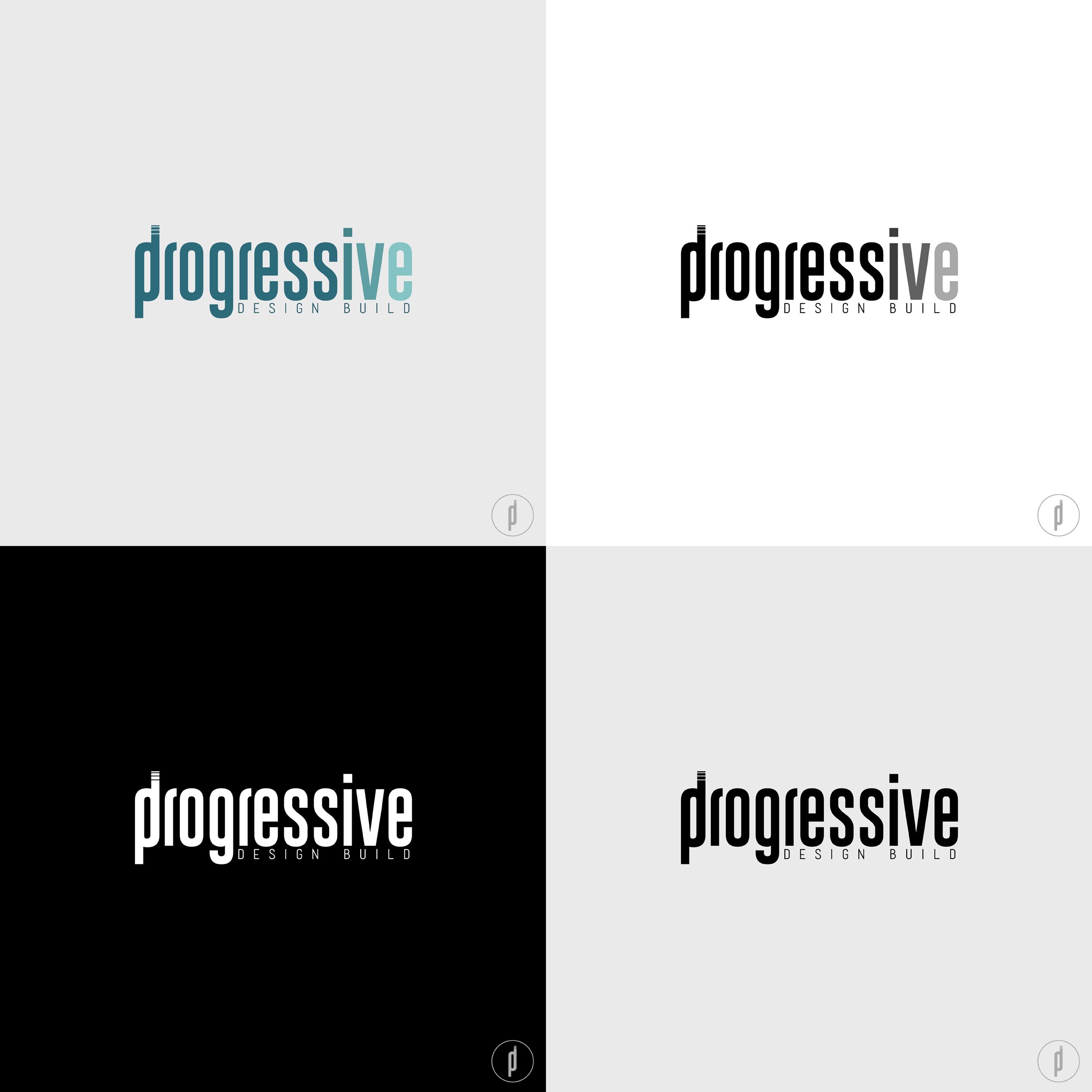
I have inserted the typography as the main element, making the logo develop through this. In the letter P, initial of "Progressive", the letters D and B are united in lowercase to concretar and to unify the total name of the company, but without separating it of the logo in general, complements it. For the final letters "i v e" i put the color in different shades to emphasize the Progressive work, as well as the 3 parts that make up the development of a project, company, client and work!