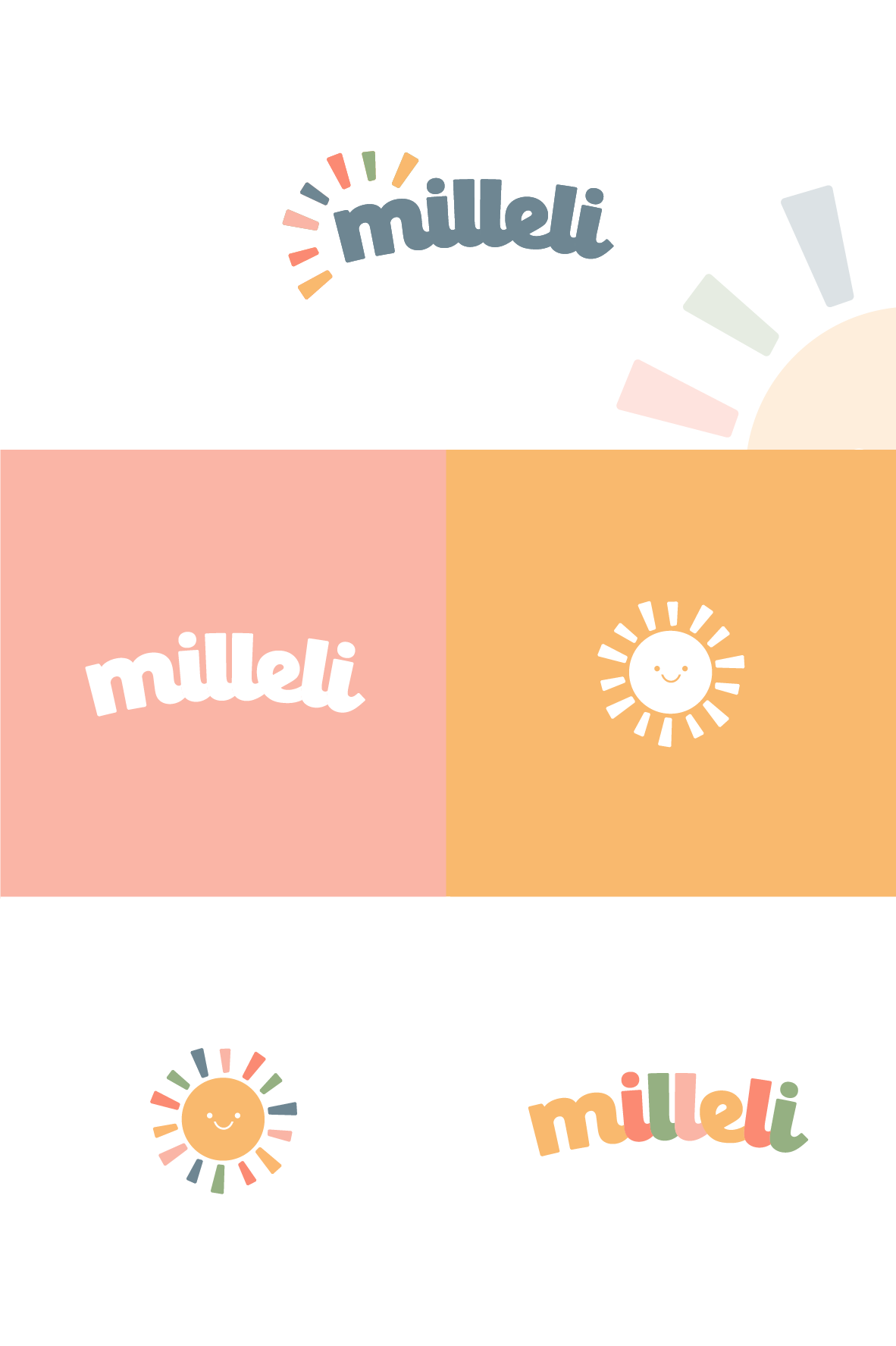
Logo and brand design for a modern kids travel brand
37
Created on 99designs by Vista
The contest holder wanted to a modern and unique logo and brand design that was representative of a kids brand without being too childlike.
They wanted a high end, modern and premium looking brand to appeal to more affluent parents/guardians who are more likely to spend their disposable income on kids travel essentials.
To incorporate the theme of travel, I created a simple sunshine mascot and then utilised the sun-rays into the main logo. The typography has been fully customised to give a chunky, rounded feel - keeping the design friendly and approachable whilst maintaining an upmarket feel.
The colour palette was a muted selection of primary and child friendly colours.
