
I always loved the simplicity in design and that is what drives me to make the marks as simple as possible but keep connection with the name or the nature of a business behind it (or both).
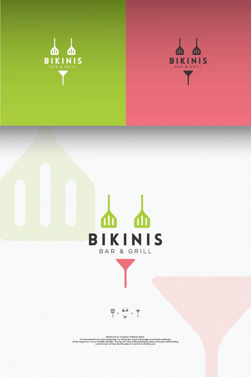
I was in a problem here thinking: "What do I focus on? Bikini or Bar&Grill? How to I use both but give it a balance?"
I was looking for inspiration online and then I noticed that the bottom part of a bikini looks like a cocktail glass - then and there idea was born! I had to make two spatulas and turn them upside down to resemble the top part of bikini and there I was, left with a perfect amount of empty space between to put the name of a bar in the Caribbean.
If the contest holder didn't pick these colors, I would probably use somewhat of a similar palette only because it gives that relaxing vibe.