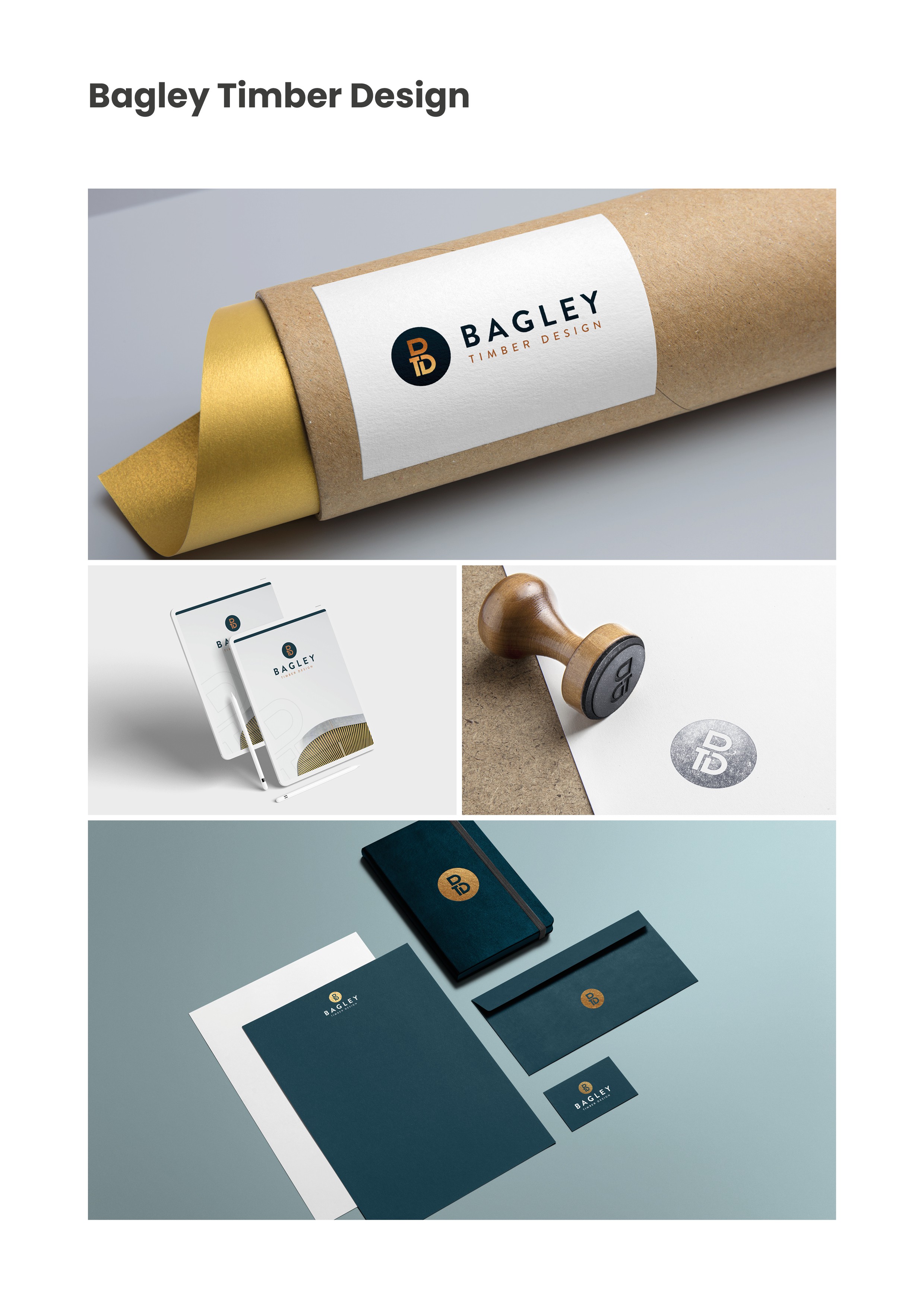

This new business was set up by an experienced timber frame designer and project manager. A brand was needed that not only communicated reliability, but assured clients that the company delivered a high standard of work.
The design uses the company initials and interlinks them in the same way a timber frame could come together. The result makes up the ‘B’ icon with a strong san serif font to re-enforce the dependable, trustworthy feel.